
© 2026 Digitalocus

Category: Website Design

  • How to Write an RFP for Website Design and Development?

    Introduction

    If you have ever opened a blank document and typed “Request for Proposal” at the top and then just stared at the cursor, you are not alone. Most business owners and marketing managers only write one of these once every few years, so it never quite feels natural. Learning how to write an RFP for website design and development is less about following a rigid template and more about giving agencies the right information so they can tell you, honestly, whether they are the right fit and what it will cost.

    This guide walks through exactly how to write an RFP for website design and development, section by section, with real examples of what to include and what to leave out. By the end, you will have a document that gets you sharper, more comparable, and more honest proposals instead of a stack of generic pitches.

    What Is an RFP for Website Design and Development?

    A request for proposal, or RFP, is a formal document that a business sends to agencies or freelancers to describe a project and invite them to propose how they would handle it. An RFP for website design and development specifically covers a new site build, a redesign, or a major platform migration, along with the goals, constraints, and expectations around that work. This is the same kind of project our own Website Development Service handles from initial strategy through launch, so we see these documents from the vendor side almost every week.

    Think of it less like a contract and more like a briefing document. A good RFP for website design and development gives an agency enough context to understand your business, your problem, and your goals, while leaving room for them to bring their own expertise to the solution.

    Quick answer

    An RFP for website design and development should explain who you are, what problem the new website needs to solve, what technical requirements matter, your rough timeline and budget, and how you will choose a partner. It should not dictate the exact design, every feature, or the agency’s internal process.

    Why Bother Writing One at All

    Some business owners skip the formal process and just call a few agencies and describe the project verbally. That works fine for very small jobs. But once a project involves multiple stakeholders, a real budget, and a business outcome you actually care about, writing an RFP for website design and development pays off in three ways.

    • It forces you to align internally first, so your team is not sending mixed signals to vendors.
    • It lets you compare proposals on equal footing, since every agency is answering the same questions.
    • It filters out agencies who are not a fit before you waste time on calls that go nowhere.

    Skipping this step usually means comparing three completely different documents, each built around a different set of assumptions, which makes the final decision harder rather than easier.

    When Should You Create a Website RFP

    You do not need an RFP for website design and development for a five-page brochure site with a fixed budget of a few hundred dollars. You do need one when the project involves several stakeholders, a meaningful budget, custom functionality, or a business-critical outcome like lead generation or online sales.

    A good rule of thumb: if getting the website wrong would hurt your business, or if more than one person needs to sign off on the decision, it is worth the extra hour it takes to write an RFP for website design and development properly. This matters even more for regional businesses. If you are based in Rajasthan and searching for Website Development Services in Udaipur, a well-written RFP helps you tell local agencies apart from generalist vendors who have never worked with a business like yours.

    How to Write an RFP for Website Design and Development: The Full Structure

    This is the core of the guide. Below is the section-by-section structure that consistently produces the strongest, most comparable proposals. You do not need every section for every project, but this order works well for most businesses learning how to write an RFP for website design and development for the first time.

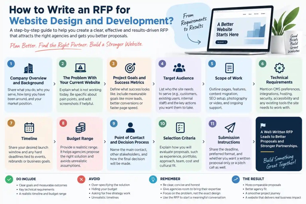
    1. Company Overview and Background

    Open with a short paragraph about your business: what you do, who you serve, how long you have been around, and where you sit in your market. Agencies use this to understand context before they even get to the project details.

    Keep this section honest rather than promotional. If you are a regional service business, say so. If you are competing against larger national players, mention that too. This context shapes how an agency will think about your new site.

    2. The Problem With Your Current Website

    If this is a redesign, describe what is actually wrong today. Slow load times, an outdated design, a confusing checkout flow, poor mobile experience, or a content management system your team dislikes are all fair to mention. Screenshots or a short list of specific complaints from your team or customers are genuinely useful here.

    Being specific about the problem is one of the most overlooked parts of writing an RFP for website design and development. Agencies can propose much sharper solutions when they know exactly what is broken instead of guessing.

    3. Project Goals and Success Metrics

    State what a successful outcome actually looks like. More qualified leads, a shorter path to purchase, better search visibility, faster page speed, or simply a site that reflects your current brand are all valid goals. Where you can, attach a number: a 20 percent increase in form submissions, a bounce rate under 40 percent, and so on.

    If lead generation or online sales is the real goal, it helps to frame it the way a Performance Marketing Service would, in terms of cost per lead and conversion rate, not just traffic or page views. This section is where your RFP for website design and development stops being a wish list and starts being something a vendor can actually plan around.

    4. Target Audience

    List who the site needs to serve. Most businesses have more than one audience, such as prospective customers, existing customers logging into an account area, and internal staff managing content. Rank them by importance and note what action you want each group to take.

    If a meaningful share of your traffic already comes from Instagram or Facebook, mention that too. It helps agencies understand how the new site should connect with whatever your Social Media Marketing Services team is already doing, instead of treating the website as something separate from the rest of your marketing.

    5. Scope of Work

    Spell out what you actually need built. This might include:

    • Number of unique page templates or page types
    • Custom features (booking systems, calculators, portals, e-commerce)
    • Content migration from the old site
    • Original photography or video, which is where a dedicated Commercial Shoot & Production Services partner is often worth bringing in before the site design even starts
    • SEO setup and technical migration requirements
    • Ongoing maintenance or a support retainer after launch

    Being clear about scope here is what keeps proposals from wildly disagreeing on price for what should be the same project.

    6. Technical Requirements

    Cover anything that affects how the site is built: required integrations (CRM, email marketing, payment gateways, booking tools), accessibility standards, browser and device support, hosting preferences, security requirements, and any existing tech stack the new site needs to work with. If your current site already ranks for valuable terms, make sure whoever handles your SEO services is looped in early so those rankings carry over instead of resetting after launch.

    If you have a preferred content management system, say so. If you are open to recommendations, say that instead. Agencies waste a lot of time proposing platforms a client had already ruled out.

    7. Timeline

    Give a realistic window rather than an arbitrary deadline pulled from a calendar. A simple marketing site can often launch in six to ten weeks. A complex site with custom functionality, e-commerce, or a large content migration can easily take four to six months. If you have a hard deadline tied to an event, a funding round, or a rebrand, mention it and explain why it matters.

    8. Budget Range

    This is the part business owners most often want to skip, but it is one of the most important parts of learning how to write an RFP for website design and development well. You do not need an exact figure, but a range helps agencies propose something realistic instead of guessing low to win the pitch and then padding the invoice later, or guessing high and pricing themselves out unnecessarily.

    If your budget is genuinely undecided, say that plainly and ask agencies to propose a few tiers instead.

    9. Point of Contact and Decision Process

    Name who will be the main point of contact during the proposal process, who else is involved in the final decision, and roughly how long the selection process will take. Agencies appreciate knowing whether they are pitching one decision maker or a committee of eight.

    10. Selection Criteria

    Explain how you will actually judge the proposals. Common factors include relevant experience, portfolio quality, proposed approach, team composition, cost, and cultural fit. If certain criteria matter more than others, say so directly.

    11. Submission Instructions

    Close with the practical details: submission deadline, preferred format, whether you want a written proposal only or also a short pitch call, and when you expect to announce a decision. Clear instructions here mean the proposals that come back are actually comparable.

    What to Include in a Website Design and Development RFP

    To recap the essentials, a strong RFP for website design and development should always include your business background, the problem you are solving, clear goals with measurable outcomes, target audience details, scope of work, technical requirements, a timeline, a budget range, your point of contact, selection criteria, and submission instructions. Miss more than one or two of these and agencies are left filling in gaps with assumptions, which rarely works in your favor.
    What to Avoid When Writing a Website RFP

    Just as important as what to include is what to leave out. A few common mistakes tend to show up again and again:

    • Over-specifying the solution. Dictating exact page layouts, specific plugins, or a rigid phase-by-phase methodology tells agencies you have already decided everything, which discourages the strongest ones from bidding at all.
    • Hiding your budget. Refusing to share even a range forces every agency to guess, which usually means you get numbers that are either wildly high or unrealistically low.
    • Asking for free strategy work. Requesting a detailed competitive analysis or a full site map as part of the proposal itself is a red flag to experienced agencies and tends to scare away better vendors rather than attract them.
    • Setting an unrealistic timeline. A four week deadline for a complex e-commerce build signals that the process has not been thought through.
    • Writing a document that is too long. If your RFP for website design and development runs past five or six pages, it usually means you are including detail that belongs in a discovery conversation instead.

    A Simple Website RFP Template You Can Copy

    If you want a quick starting point, here is a lightweight structure you can paste into a document and fill in:

    1. Company Overview: who you are and what you do
    2. Current Website Problems: what is not working today
    3. Project Goals: what success looks like, with numbers where possible
    4. Target Audience: who the site needs to serve
    5. Scope of Work: pages, features, content, and support needed
    6. Technical Requirements: CMS, integrations, hosting, accessibility
    7. Timeline: desired launch window and any hard deadlines
    8. Budget Range: even a rough range is better than none
    9. Point of Contact: who agencies should talk to
    10. Selection Criteria: how you will choose a partner
    11. Submission Instructions: deadline, format, and next steps

    This structure covers everything most businesses need when figuring out how to write an RFP for website design and development, without turning into a fifteen page procurement document.

    How Agencies Actually Evaluate an RFP

    It helps to think about your RFP for website design and development from the other side of the table. Agencies that receive dozens of these a month tend to prioritize proposals where the goals are clear, the budget is honest, and the scope is realistic against the timeline. Local context matters here too. An agency offering SEO Services in Udaipur will often ask sharper, more specific questions about your current rankings before quoting a redesign than a purely remote vendor would, simply because they understand the local competition. A well-written RFP for website design and development is often the first signal an agency uses to judge what it will be like to work with you, long before the project even starts.

    After the Website Launches

    A new website is rarely the finish line. Once your site is live, the real work of turning visitors into customers begins. Many businesses that write an RFP for website design and development end up asking the same agency to keep going with Performance Marketing Services in Udaipur to drive qualified local traffic once the new site is ready, rather than starting a separate search for a marketing partner from scratch.

    Conclusion

    Learning how to write an RFP for website design and development is really about communication more than paperwork. The goal is not to control every decision an agency makes, but to give them enough honest, specific information that they can respond with a proposal you can actually trust and compare. Cover your background, your goals, your constraints, and your budget, then let the agencies you are considering show you how they would solve the problem.

    If your project also needs strong visuals before launch, it is worth mentioning that upfront too. Bundling Commercial Shoot & Production Services in Udaipur into the same RFP for website design and development can save you a second procurement process later and keep the photography style consistent with the finished site. If you would rather skip the formal document entirely and just have a conversation, that works too. A quick call is often faster than a written RFP, especially for a smaller project, and it lets both sides ask questions in real time instead of guessing at intent from a document.

    FAQs About Writing an RFP for Website Design and Development

    What is the ideal length for a website RFP? 

    Most strong RFPs run three to five pages. Anything much longer usually means you are including details that belong in a later discovery conversation rather than the initial document.

    Do I need to include an exact budget in my RFP? 

    No, but you should include a range. An exact figure is not required, but refusing to share any budget information at all usually leads to proposals that are hard to compare fairly.

    How many agencies should I send an RFP for website design and development to? 

    Three to five is typically enough. Sending it to more than that rarely improves your options and just adds time to the review process.

    Should I dictate the exact design or features I want? 

    No. Describe the problem and the goals clearly, but leave room for the agency to propose a solution. Over-specifying the design usually results in less creative, cookie-cutter proposals.

    Is it worth choosing a local agency over a remote one? 

    It depends on the project, but for a business that depends on nearby customers, a partner offering Social Media Marketing Services in Udaipur alongside the website build can keep your messaging consistent across the site and your social channels in a way a remote generalist may not.

    What is the difference between an RFP and an RFQ for a website project? 

    An RFP for website design and development asks agencies to propose an approach along with pricing, while a request for quote, or RFQ, typically asks only for a price against a spec you have already finalized.

    How long does the RFP process usually take? 

    From sending the RFP to signing a contract, most businesses take four to eight weeks, including proposal review, follow-up calls, and internal decision-making.

    Can I use the same RFP template for a redesign and a brand new website? 

    Mostly yes, though a redesign should include a dedicated section on what is wrong with the current site, which a brand-new build obviously will not have.
  • Best Programming Languages for Web Development in 2026

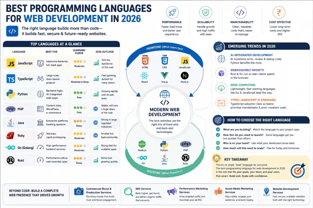
    Choosing the right coding language can make or break a website project and that is exactly why so many founders, developers, and marketing teams spend hours researching the best programming languages for web development in 2026 before writing a single line of code. The web has changed a lot in the last few years, and the languages that power it have changed right along with it. Some old favorites are still going strong, some newer languages are climbing fast, and a few are quietly fading into the background.

    This guide breaks down the best programming languages for web development in 2026 in plain, practical terms. You will learn what each language is good at, where it falls short, and how to pick the right one for your own website, app, or business platform. Whether you are a student picking a first language, a founder planning a new product, or a business owner trying to understand what your development team is talking about, this article was written for you.

    Why Choosing the Right Language Matters in 2026

    Websites today do a lot more than display text and images. They handle payments, real-time chat, AI-powered recommendations, and complex dashboards, all while loading fast on a phone with a weak signal. That is a tall order, and it is one big reason the conversation around the best programming languages for web development in 2026 has become so important for businesses of every size.

    Pick the wrong language for a project and you end up with slow performance, a codebase nobody wants to maintain, and a development team that spends more time fighting the tools than building features. Pick the right one and your site loads quickly, scales smoothly as traffic grows, and stays easy to update for years to come. This is also why many businesses skip the guesswork entirely and bring in a professional Website Development Service to handle the technical decisions from day one.

    What Are the Best Programming Languages for Web Development in 2026?

    Before diving into individual languages, here is a quick snapshot comparing the top contenders for the best programming languages for web development in 2026.

    LanguageBest ForLearning Curve2026 Outlook
    JavaScriptInteractive frontends, full-stack appsModerateStill the backbone of the web
    TypeScriptLarge-scale, team-based projectsModerate to steepFast-growing, now default for many teams
    PythonBackend logic, AI-integrated web appsEasyGrowing rapidly with AI web tools
    PHPContent sites, WordPress, e-commerceEasyStable, still runs a huge share of the web
    JavaEnterprise platforms, banking systemsSteepStrong in large, regulated industries
    RubyStartups, rapid prototypingModerateSmaller but loyal community
    Go (Golang)High-performance backend servicesModerateRising fast for scalable apps
    RustPerformance critical web assembly appsSteepNiche but growing quickly

    Let us look at each of these in more detail.

    JavaScript

    JavaScript remains the most widely used language on the web, and it is still the first name that comes up in almost every list of the best programming languages for web development in 2026. It runs in every browser without any extra setup, and with Node.js it also handles backend work, so one language can cover an entire application from front to back.

    JavaScript works well for interactive interfaces, single-page applications, and real-time features like live chat or notifications. The ecosystem around it, including React, Vue, and Next.js, is enormous, which means there is no shortage of tutorials, libraries, or developers who already know it.

    TypeScript

    TypeScript is JavaScript with a safety net. It adds static typing, which catches errors before the code ever runs, and that alone has made it one of the fastest-growing entries on any list of the best programming languages for web development in 2026. Larger teams especially like it, because typed code is easier to read, easier to refactor, and much easier to hand off between developers.

    If you are building something that will grow over time, with multiple developers touching the same codebase, TypeScript is usually worth the slightly steeper learning curve.

    Python

    Python has quietly become a serious contender in web development alongside its long standing strength in data science. Frameworks like Django and Flask make it simple to build secure, well-structured backends, and Python’s clean syntax means new developers pick it up fast. With AI features now showing up inside everyday websites, from chatbots to personalized recommendations, Python’s strong AI and machine learning libraries give it a real edge among the best programming languages for web development in 2026.

    PHP

    PHP still powers a huge portion of the internet, largely because WordPress runs on it and WordPress alone powers a massive share of all websites globally. Modern PHP, especially with frameworks like Laravel, is faster, cleaner, and far more capable than the PHP many people remember from a decade ago. For content heavy sites, blogs, and e-commerce stores, PHP continues to earn its spot among the best programming languages for web development in 2026, especially for businesses that want a fast build with a lower cost of ownership.

    Java

    Java is the workhorse of large, regulated industries like banking, insurance, and healthcare. It is verbose compared to newer languages, and it takes longer to learn, but its stability and security track record are hard to beat. Enterprises that need a platform to run reliably for a decade or more still lean on Java, keeping it firmly on the list of the best programming languages for web development in 2026 for large-scale systems.

    Ruby

    Ruby, and specifically Ruby on Rails, is loved for how quickly it lets small teams build and launch a working product. Startups testing an idea often reach for Ruby because it favors convention over configuration, meaning developers spend less time deciding how to structure things and more time actually building. Its community is smaller than it once was, but it remains a solid choice among the best programming languages for web development in 2026 for fast-moving teams.

    Go (Golang)

    Go was built by Google with speed and simplicity in mind, and it shows. It compiles fast, runs fast, and handles thousands of simultaneous connections without breaking a sweat, which is exactly what modern, high-traffic web services need. As more companies deal with scale from day one, Go keeps climbing the rankings of the best programming languages for web development in 2026, particularly for backend services and APIs.

    Rust

    Rust trades a steep learning curve for serious performance and memory safety. The curve takes real effort to climb, yet for WebAssembly projects, browser-based games, and performance-critical applications, it is quickly earning a reputation as one of the best programming languages for web development in 2026 for teams that need every millisecond to count.

    Frontend vs Backend: Different Jobs, Different Languages

    A common point of confusion is thinking there is one single answer to which language wins overall. In reality, most modern websites use a mix. JavaScript and TypeScript dominate the frontend, the part users actually see and click on, while Python, PHP, Java, and Go often handle the backend, the part that manages data, logic, and security behind the scenes.

    This split is one reason discussions around the best programming languages for web development in 2026 usually break down into separate frontend and backend categories rather than naming one universal winner. A well-built website blends both sides smoothly, and getting that blend right usually calls for an experienced Website Development Service rather than a single freelancer juggling every layer alone.

    Emerging Trends Shaping Languages in 2026

    A few trends are quietly reshaping which languages rise and which ones fade.

    • AI-integrated development. AI coding assistants now write, review, and debug code inside popular editors, and languages with strong AI library support, like Python, benefit the most from this shift.
    • WebAssembly growth. WebAssembly lets languages like Rust and Go run at near native speed inside a browser, opening doors that were closed to web developers just a few years ago.
    • Edge computing. Running code closer to the user, rather than in one central server, is pushing lightweight, fast-starting languages like Go and JavaScript further into backend territory.
    • Typed JavaScript is becoming standard. TypeScript adoption keeps climbing as teams prioritize maintainable, error-resistant code over quick and messy prototypes.

    Each of these trends feeds directly into how people evaluate the best programming languages for web development in 2026, since speed, AI compatibility, and maintainability now matter as much as raw popularity.

    How to Choose the Best Programming Language for Your Web Project

    There is no single right answer here, only the right answer for your specific project. A few questions can help narrow things down.

    1. What are you building? A content site leans toward PHP or JavaScript. A data-heavy platform leans toward Python. A large enterprise system leans toward Java.
    2. How fast do you need to launch? Ruby and PHP tend to get simple products live quickly. Go and Rust ask for more setup time upfront in exchange for long-term performance.
    3. Who is on your team? The best language on paper is not always the best choice if your developers already know something else well.
    4. How much will this need to scale? If you expect rapid growth, languages like Go or a well-typed JavaScript stack with TypeScript tend to age better.

    Answering these honestly is often more useful than chasing whatever list of the best programming languages for web development in 2026 happens to be trending that week. Many businesses find it easier to describe their goals to a development partner and let that partner recommend the stack, which is exactly the kind of decision a solid Website Development Service helps with every day.

    Beyond the Code: Building a Complete Web Presence

    Picking one of the best programming languages for web development in 2026 is only the first step. A technically well-built site still needs the right visuals, the right visibility, and the right audience to actually succeed.

    Strong product photography and video content make a site feel trustworthy the moment it loads, which is where professional Commercial Shoot & Production Services come in, especially for e-commerce and hospitality brands that live or die by their imagery. A beautifully coded site with weak visuals still underperforms, so the two need to work together from the start.

    Once the site is live, ranking on Google matters just as much as how it was built. Server-rendered pages in Python, PHP, or a well-configured JavaScript framework can be fast and clean, but they still need proper technical and content optimization from experienced SEO services to actually show up in search results. Traffic does not arrive on its own just because the backend is well coded.

    Paid traffic is the other half of the growth equation. A fast, well-built site converts visitors far better than a slow one, which makes it the perfect foundation for a Performance Marketing Service to run ads that actually pay off instead of leaking budget on a site that cannot convert. And since most audiences now discover brands through their feed before they ever type a search query, ongoing Social Media Marketing Services help keep that same audience engaged long after the first visit.

    Best Programming Languages for Web Development in 2026 for Udaipur Businesses

    Local businesses in Udaipur are increasingly competing with national and even international brands online, which chooses language and platform more important than ever. A heritage hotel, a boutique retailer, or a growing manufacturing firm in the city all need sites that load fast on mobile, rank well locally, and reflect the brand properly.

    For most local businesses, PHP-based platforms like WordPress or a JavaScript and TypeScript stack strike the right balance between cost, speed, and flexibility, and these remain some of the best programming languages for web development in 2026 for small and mid-sized companies in the region. Working with a team offering dedicated Website Development Services in Udaipur means the build accounts for local hosting speed, regional search behavior, and the kind of content that resonates with a Udaipur audience.

    A website alone rarely finishes the job. Businesses in the city are pairing new sites with focused SEO Services in Udaipur to capture local search traffic, Performance Marketing Services in Udaipur to drive qualified leads through paid channels, and Social Media Marketing Services in Udaipur to stay visible where their customers already spend time. For brands in tourism, hospitality, and retail, high-quality visuals matter just as much, and local Commercial Shoot & Production Services in Udaipur help capture the look and feel of the city itself inside the brand’s photos and videos, something a generic stock image can never replicate.

    Conclusion

    There is a lot of noise out there about which language is winning the popularity contest this year, but the real answer to the best programming languages for web development in 2026 depends entirely on what you are building and who is building it. JavaScript and TypeScript remain the backbone of modern frontends, Python keeps growing thanks to AI integration, PHP still runs a massive share of the web through platforms like WordPress, and Go and Rust are earning their place for performance-heavy applications.

    Rather than chasing trends, focus on your project’s goals, your team’s strengths, and how much the platform needs to scale over the next few years. Get that decision right, pair it with strong visuals, sound SEO, and consistent marketing, and the technical choice becomes a lot less stressful. If you would rather hand that decision to people who live in this world every day, a trusted Website Development Service can guide you to the right stack and build on it with confidence.

    Read: Top Website Design Features That Influence Buyer Decisions 

    Frequently Asked Questions

    What is the best programming language for web development in 2026?

    There is no single winner, but JavaScript and TypeScript lead frontend development, while Python, PHP, and Go are strong backend choices. Among the best programming languages for web development in 2026, the right pick depends on your project type, team skills, and growth plans rather than one universal answer.

    Is Python still good for web development in 2026?

    Yes, Python continues to grow in popularity for web development, especially for projects that need AI features, data processing, or a clean, readable codebase. Frameworks like Django and Flask keep it firmly among the best programming languages for web development in 2026 for backend-heavy applications.

    Should beginners learn JavaScript or Python first?

    Both are solid starting points. JavaScript is useful because it runs directly in the browser and covers both frontend and backend work through Node.js, while Python is known for its simple, readable syntax. Many beginners choose JavaScript first if they want to build visual, interactive websites quickly.

    Is PHP outdated in 2026?

    No, PHP is not outdated. Modern PHP, especially through frameworks like Laravel, remains fast, secure, and widely used, largely because it still powers WordPress and a huge share of the internet’s content-driven sites.

    Why is TypeScript becoming so popular?

    TypeScript adds type checking to JavaScript, which catches bugs before code runs and makes large codebases easier to maintain. As teams and projects grow more complex, this reliability has made TypeScript one of the fastest rising languages among the best programming languages for web development in 2026.

    Do I need to know coding to hire a web development team?

    No, you do not need coding knowledge to hire a development team. A good agency will explain your options in plain language, recommend a language and framework based on your goals, and handle the technical work, much like a professional Website Development Service does for its clients every day.

    Which language is best for a small business website?

    For most small businesses, PHP-based platforms like WordPress or a straightforward JavaScript setup offer the fastest, most affordable path to a professional site, which is why they remain popular picks among the best programming languages for web development in 2026 for smaller budgets.

    How does language choice affect SEO?

    Language choice affects page speed, how easily content renders for search engines, and how quickly a site can be updated with fresh content, all of which influence rankings. That said, even the best coded site still needs ongoing optimization from proper SEO services to reach its full ranking potential.

  • Best Website Design for Small Business in India

    Your customers are searching for businesses like yours on their phones right now, and if your website does not show up, look professional, or load fast, they simply move to the next result. That is the real reason so many owners are hunting for the best website design for small business in India this year. A website is no longer a nice extra. It is the first handshake, the first sales pitch, and often the first impression a customer forms about your brand.

    In this guide, we will walk through what actually makes the best website design for small business in India, the features every small business site needs, current design trends, realistic costs, common mistakes, and how to pick the right partner to build it. Whether you run a boutique in Udaipur, a clinic in Jaipur, or a manufacturing unit in Ahmedabad, the fundamentals stay the same, and this blog covers all of them in one place.

    What Makes a Website “The Best” for a Small Business?

    There is no single template that works for every business, but there is a shared foundation behind the best website design for small business in India. It comes down to three things: the website looks credible, it loads quickly on any device, and it makes it easy for a visitor to take the next step, whether that is calling, messaging, or filling a form.

    A quick-answer summary: the best website design for small business in India is mobile-friendly, fast, easy to navigate, search-engine optimized, and built around clear calls to action that turn visitors into leads.

    Design alone will not carry a website. It needs to be paired with the right structure, the right content, and the right technical foundation. That combination is what separates a website that just exists from one that actually brings in business.

    Why Small Businesses in India Need a Strong Website in 2026

    India now has hundreds of millions of internet users, and a large share of local searches happen on mobile devices, often with intent to buy within a day. A small business without a solid online presence is invisible to this audience, no matter how good the product or service is offline.

    Here is why investing in the best website design for small business in India pays off:

    • Trust and credibility: A clean, professional website reassures a new customer that your business is legitimate and established.
    • 24×7 visibility: Your website works even when your shop is closed, answering questions and capturing enquiries around the clock.
    • Level playing field: A well-designed website lets a small business compete with bigger brands in the same city or category.
    • Better lead quality: A site built with clear information filters out casual browsers and brings in genuinely interested visitors.
    • Foundation for marketing: Every ad, social post, or search result eventually sends people to your website, so it needs to convert once they arrive.

    Small businesses that treat their website as a growth tool, not just a digital brochure, consistently see better enquiries and repeat customers.

    Key Features of the Best Website Design for Small Business in India

    If you are evaluating a design or briefing a developer, these are the features that consistently show up in the best website design for small business in India.

    Mobile-First and Responsive Design

    Most Indian users will find your business through a phone. A mobile-first layout means buttons are easy to tap, text is readable without zooming, and pages rearrange smoothly on smaller screens. Responsive design is no longer optional; it is the baseline for the best website design for small business in India.

    Fast Loading Speed

    A slow website loses visitors within seconds. Compressed images, clean code, and reliable hosting keep load times low. Speed also affects how Google ranks your pages, so it directly supports your visibility in search results.

    Clear Navigation and User Experience

    Visitors should reach the information they need in two or three clicks. A simple menu, visible contact details, and a logical page structure keep people on your site instead of bouncing back to Google.

    Strong Visual Branding and Photography

    Stock images make a small business website feel generic. Original photos of your products, team, and premises build trust instantly. This is where professional Commercial Shoot & Production Services make a real difference, since high-quality visuals are one of the fastest ways to elevate a website from average to genuinely one of the best website design for small business in India examples in your industry.

    SEO-Friendly Structure

    A beautiful website that nobody finds is not doing its job. Clean URLs, optimized headings, fast pages, and proper metadata are technical basics that support long-term visibility. Pairing your website with professional SEO services ensures the design and the search strategy work together instead of in isolation.

    Clear Calls to Action and Lead Capture

    Every page should guide the visitor toward a next step, whether it is “Book a Consultation,” “Get a Quote,” or “Call Now.” Forms should be short, and contact information should never be hidden.

    Trust Signals

    Testimonials, client logos, certifications, Google reviews, and secure checkout badges all reduce hesitation. These small elements often decide whether a visitor converts or leaves.

    Step-by-Step Process to Build the Best Website Design for Small Business in India

    Building a website that performs well is a process, not a one-time task. Here is the typical path agencies follow to deliver the best website design for small business in India.

    1. Define goals and audience. Decide what the website needs to achieve, whether that is bookings, product sales, or enquiries, and who it needs to speak to.
    2. Plan the structure. Map out pages, content, and user journeys before any design work begins, so the site has a logical flow from the homepage to the contact page.
    3. Design the interface. This is where branding, color, typography, and layout come together into a visual identity that matches your business.
    4. Develop and build. A skilled Website Development Service turns the design into a functioning, secure, and fast website using the right technology for your needs.
    5. Test across devices. Every page is checked on different phones, tablets, and browsers to catch layout or speed issues before launch.
    6. Launch and promote. Once live, the website needs traffic. This is where SEO services, a focused Performance Marketing Service, and consistent Social Media Marketing Services work together to bring in visitors and convert them into customers.

    Skipping any one of these steps is usually why a website underperforms, even when the design itself looks good.

    Latest Website Design Trends for Small Businesses in India (2026)

    Trends change every year, but a few are genuinely shaping the best website design for small business in India right now:

    • Minimal, clutter-free layouts that load fast and keep attention on the message.
    • Micro-interactions, such as subtle button animations, that make a site feel modern without slowing it down.
    • AI-assisted chat and lead capture that answers basic customer questions instantly, even outside business hours.
    • Voice search readiness, since more users are asking questions aloud rather than typing them.
    • Video and motion content on homepages, often produced through Commercial Shoot & Production Services, to show products or services in action rather than static photos alone.
    • Accessibility improvements, including readable fonts and proper color contrast, so the site works for every visitor.

    A website built around these trends today will stay relevant for the next few years rather than needing a redesign every twelve months.

    How Much Does the Best Website Design for Small Business in India Cost?

    Pricing varies widely depending on scope, but here is a realistic range small business owners can expect:

    Website TypeTypical Investment RangeBest For
    Basic informational websiteLower budget, template-basedLocal shops, service providers just starting online
    Custom business websiteMid-range, tailored designGrowing businesses that need branding and lead capture
    E-commerce websiteHigher investmentBusinesses selling products directly online
    Website with ongoing SEO and marketingRecurring monthly investmentBusinesses aiming for consistent leads and rankings

    The cheapest option is rarely the best website design for small business in India in the long run, because template sites often need a rebuild within a year or two. It is usually more cost-effective to invest once in a proper Website Development Service that can scale with your business.

    Common Mistakes Small Businesses Make with Website Design

    Even well-intentioned businesses fall into the same traps. Avoiding these is part of what defines the best website design for small business in India:

    • Ignoring mobile users, resulting in a site that looks broken on phones.
    • Ignoring page speed, which quietly drives visitors away before they see anything.
    • Missing or buried contact information, making it hard for interested customers to reach you.
    • No clear call to action, leaving visitors unsure what to do next.
    • Treating the website as a one-time project instead of updating content, offers, and images regularly.
    • Skipping SEO entirely, so the website exists but almost nobody finds it organically.
    • Using generic stock photography instead of real images from a Commercial Shoot & Production Services session.

    Fixing even two or three of these issues can noticeably improve enquiries within a few months.

    How to Choose the Right Agency for the Best Website Design for Small Business in India

    Picking a partner is often harder than picking a design style. A few things worth checking before you sign on:

    • Portfolio relevance: Look at websites they have built for businesses similar in size or industry to yours.
    • Transparent process: A good agency explains timelines, revisions, and what happens after launch.
    • Combined expertise: The strongest partners offer design alongside SEO services, a Performance Marketing Service, and Social Media Marketing Services, so your website is not built in isolation from your marketing.
    • Local understanding: An agency familiar with your city and customer behavior tends to design more effectively for local intent, which matters for local SEO and trust.
    • Post-launch support: Websites need updates, security patches, and content changes long after launch, so ongoing support matters.

    If you are based in Rajasthan, working with a local team offering Website Development Services in Udaipur, SEO Services in Udaipur and Social Media Marketing Services in Udaipur means your entire online presence, from design to promotion, is handled under one roof, with a team that understands the local market firsthand.

    Bringing Design and Marketing Together

    A website rarely succeeds in isolation. The best website design for small business in India is the one connected to a complete digital strategy. Once your site is live, it needs consistent SEO services to rank for the terms your customers are actually searching, a Performance Marketing Service to drive immediate, targeted traffic, and active Social Media Marketing Services to keep your brand visible between visits.

    Businesses that combine strong design with this kind of ongoing marketing consistently outperform those that treat their website as a finished, standalone project.

    Conclusion

    Choosing the best website design for small business in India is not about chasing the trendiest layout. It is about building a site that loads fast, works flawlessly on mobile, communicates trust at a glance, and makes it effortless for a visitor to become a customer. Combine that foundation with real photography, solid SEO services, and consistent marketing, and your website stops being a static page and becomes one of your strongest business assets.

    If you are ready to build or upgrade your website, start with a clear plan, invest in a capable Website Development Service, and pair the design with the marketing support needed to bring visitors in and turn them into customers.

    Read: How to Create a Landing Page in 2026 

    FAQs

    What is the best website design for small business in India right now? 

    The best website design for small businesses in India in 2026 is mobile-first, fast-loading, SEO-friendly, and built with clear calls to action. There is no single “best” template, since the right design depends on your industry, audience, and goals, but these principles apply across almost every small business.

    How much does a good small business website cost in India? 

    Costs vary based on complexity, ranging from budget-friendly template sites to fully custom builds with e-commerce and ongoing SEO support. Most small businesses see the best return from a mid range custom website paired with basic SEO from day one.

    How long does it take to design and launch a small business website? 

    A straightforward business website typically takes a few weeks from planning to launch, while a custom or e-commerce site can take longer depending on features, content readiness, and revision rounds.

    Do small businesses really need SEO along with website design? 

    Yes. A well-designed website without SEO services is like a shop with no signboard. SEO helps your target customers actually discover your website when they search for your products or services online.

    Can I redesign my existing website instead of building a new one?

    Absolutely. Many businesses improve results significantly just by redesigning an outdated site, improving speed, and updating content, rather than starting completely from scratch.

    Which platform is best for a small business website in India?

    The right platform depends on your needs. Content-driven businesses often do well with flexible CMS platforms, while product-based businesses usually need dedicated e-commerce platforms. A good Website Development Service will recommend the platform based on your goals rather than a one-size-fits-all approach.

    Does professional photography really impact website design?

    Yes, noticeably. Real photos from Commercial Shoot & Production Services build trust far more effectively than stock images, and they are often the first thing a visitor notices when they land on your homepage.

    How do I know if my current website design needs improvement?

    Warning signs include high bounce rates, low mobile usability scores, slow load times, few enquiries despite decent traffic, and an outdated visual style. Any of these suggest it is time to review your design against current best website design for small businesses in India.

  • Best Website Header Design Templates to Create a Strong First Impression

    Imagine landing on a website and, within a couple of seconds, deciding whether to stay or click away. That decision usually happens before anyone reads a single line of your content. It happens at the header.

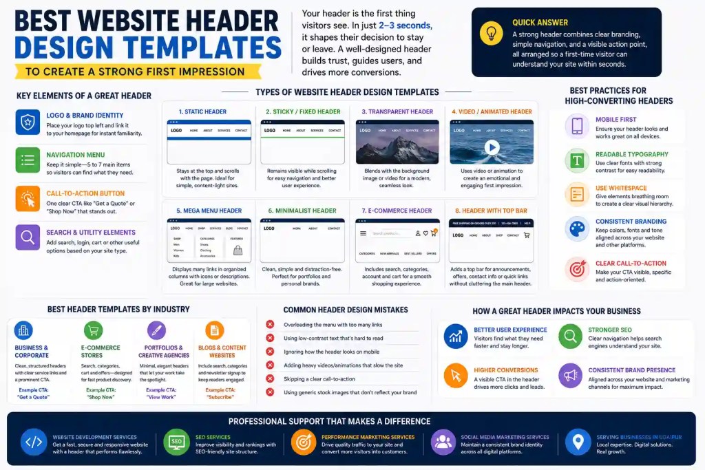
    Your header is the handshake of your website. It tells visitors who you are, what you do, and where to go next, all before they scroll an inch. If you’re planning a redesign or building a site from scratch, picking from the best website header design templates available today can save you time while still giving your brand a polished, professional look.

    In this guide, we’ll walk through what makes a header effective, the different types of website header design templates you can choose from, industry-specific examples, common mistakes to avoid, and practical tips to help your header do its job well. Whether you’re a small business owner, a marketer, or a designer picking a template for a client, this guide covers everything you need before you commit to a layout.

    What Is a Website Header and Why Does It Matter

    A website header sits at the very top of every page and usually stays there across your entire site. It typically holds your logo, main navigation, and often a call-to-action button. Think of it as the front door of your digital storefront. People form an opinion about your business in roughly 2 to 3 seconds of landing on a page, and most of that judgment is based on what they see up top.

    A cluttered, confusing, or outdated header can push visitors away before they even see your product or service. On the other hand, a clean, purposeful header builds instant trust and guides people exactly where you want them to go, whether that’s a product page, a contact form, or a blog post.

    This is why choosing among the best website header design templates isn’t just a design decision. It’s a business decision that affects bounce rate, engagement, and ultimately conversions.

    Quick Answer

    A strong header combines clear branding, simple navigation, and a visible action point, all arranged so that a first-time visitor can understand your site within seconds.

    Key Elements Every Great Header Design Should Include

    Before picking a template, it helps to know what a header needs to do to do its job. Most high-performing headers share a similar set of building blocks, even if the visual style differs.

    Logo and Brand Identity

    Your logo should sit in a spot people expect, usually top left, and link back to your homepage. It needs to be clear at any screen size, from a large desktop monitor to a small phone screen. If your brand relies heavily on visuals, professional photography or video used in and around the header can make a noticeable difference, which is why many businesses turn to Commercial Shoot & Production Services to capture header-ready brand imagery instead of relying on stock photos that look the same as everyone else’s.

    Navigation Menu

    Keep your main menu to five or seven items at most. Visitors get overwhelmed when they’re given too many choices, and a long list of links dilutes the ones that actually matter for your business goals.

    Call-to-Action Button

    Every header benefits from one clear action, whether that’s “Book a Call,” “Shop Now,” or “Get a Quote.” This button should stand out through color or contrast, not size alone.

    Search Bar and Utility Elements

    Depending on your website type, a search bar, account login, or shopping cart icon may belong in the header too. These are optional but expected on content-heavy sites and online stores.

    Types of Website Header Design Templates You Can Use

    There isn’t a single right way to design a header. The best choice depends on your industry, your content, and how your visitors browse. Here are the most common header templates used across modern websites today.

    Static Header Templates

    A static header stays fixed at the top and scrolls away with the rest of the page. It works well for simple, content-light sites where the header doesn’t need to follow the user down the page.

    Sticky or Fixed Header Templates

    A sticky header remains visible even as visitors scroll down. This keeps navigation and your call-to-action within reach at all times, which is especially useful for long pages, blogs, or e-commerce category pages where people scroll extensively before deciding to act.

    Transparent and Overlay Headers

    These headers blend into a hero image or video background, giving the page a seamless, modern look. They work best when paired with high-contrast text so navigation stays readable against busy backgrounds.

    Video and Animated Background Headers

    Video headers create an immediate emotional connection, often used by hospitality, travel, and lifestyle brands. Because these headers rely so heavily on visual quality, businesses generally invest in a proper Commercial Shoot & Production Services team rather than using generic footage that doesn’t match their brand tone.

    Mega Menu Headers

    If your website has a large catalog or multiple service categories, a mega menu template lets you organize dozens of links into neat columns, often with icons or short descriptions. This works particularly well for e-commerce and multi-service businesses.

    Minimalist Header Templates

    Minimalist headers use generous white space, a simple logo, and just two or three navigation links. They’re popular among portfolios, personal brands, and boutique businesses that want an uncluttered, premium feel.

    E-commerce Header Templates

    These typically combine a search bar, cart icon, account access, and category navigation, all packed efficiently so shoppers can find products fast without feeling overwhelmed.

    Header With a Notification or Utility Bar

    A thin bar above the main header is a good spot for time-sensitive information, a shipping offer, a phone number, or a quick link to social channels. It adds function without crowding the primary navigation.

    Best Website Header Design Templates by Industry

    Different businesses need different header priorities. Here’s how the right template shifts depending on your industry.

    For Business and Corporate Websites

    Corporate sites benefit from clean, structured headers with clear service categories and a prominent “Contact Us” or “Get a Quote” button. If you’re building or rebuilding a corporate site, working with a dedicated Website Development Service ensures the header isn’t just visually appealing but also technically solid across browsers and devices.

    For E-commerce Stores

    Online stores need headers built for speed and product discovery. Search functionality, category dropdowns, and a visible cart icon are non-negotiable here.

    For Portfolios and Creative Agencies

    Creative businesses often go minimal, letting the work speak for itself. A clean header with just a logo, a couple of links, and a bold hero visual usually performs better than a busy navigation bar.

    For Blogs and Content Websites

    Content sites benefit from a header that includes search, category links, and sometimes a newsletter signup prompt, helping readers find more of what they came for.

    Best Practices for Designing a Header That Converts

    Picking a good template is only half the job. How you customize it determines whether it actually performs.

    Keep Navigation Simple

    Stick to five to seven main links. If you have more pages to showcase, group them under dropdowns instead of listing everything individually.

    Optimize for Mobile First

    More than half of web traffic today comes from mobile devices. Your header needs a clean hamburger menu, tap targets of at least 44×44 pixels, and text that’s easy to read on smaller screens.

    Prioritize Typography and Readability

    Use legible fonts sized at least 16px, with strong contrast between text and background. Readability matters more than decorative fonts when it comes to headers.

    Use Whitespace to Create Hierarchy

    Cramped headers feel chaotic. Give your logo, menu, and CTA button breathing room so visitors can process the layout instantly.

    Keep Branding Consistent

    Your header colors, fonts, and tone should match your footer and the rest of your site. Consistency builds trust, and it also reflects well when your brand shows up across other channels, including the profiles managed under your Social Media Marketing Services.

    How a Well-Designed Header Supports SEO and Conversions

    A header isn’t just a design element, it also plays a role in how search engines and users interact with your site. Clear navigation helps search engines understand your site structure, which supports the technical side of SEO services. A fast-loading, well-coded header also reduces bounce rate, a signal search engines factor into rankings.

    On the conversion side, a header with a strong, visible CTA can meaningfully lift click-through rates on paid campaigns too. This is particularly relevant if you’re running paid traffic, since visitors arriving through ads form judgments even faster, making the header’s role in a broader Performance Marketing Service strategy more important than most businesses realize.

    Common Header Design Mistakes to Avoid

    Even with a good template, a few missteps can undo all that effort:

    • Overloading the menu with too many links
    • Using low-contrast text that’s hard to read
    • Ignoring how the header looks on mobile
    • Adding autoplay video or heavy animations that slow load time
    • Skipping a clear call-to-action
    • Using generic stock images that don’t reflect the actual brand

    Avoiding these issues usually comes down to testing your header across devices and getting a second opinion before launch.

    How Professional Design and Marketing Support Can Elevate Your Header

    A great header rarely happens by accident. It’s usually the result of thoughtful design paired with the right supporting services. If you’re a business in Udaipur planning a new site or a redesign, working with a team offering Website Development Services in Udaipur means your header is built with local market context in mind, not just generic templates pulled off a marketplace.

    Once your header is live, it needs to actually reach people. Pairing your new design with SEO Services in Udaipur helps your site get discovered organically, while Performance Marketing Services in Udaipur ensures your paid campaigns land visitors on a page that’s built to convert them. And since your header often mirrors your brand’s visual identity across other platforms, keeping it aligned with Social Media Marketing Services in Udaipur helps maintain a consistent look wherever your audience finds you.

    Conclusion

    Your header carries more weight than most website owners realize. It’s the first thing visitors see, the first impression of your brand, and often the deciding factor in whether someone stays or leaves. Choosing from the best website header design templates gives you a strong starting point, but the real difference comes from how you tailor that template to your brand, your audience, and your goals.

    Whether you’re building a minimalist portfolio header, a mega menu for a growing e-commerce catalog, or a sticky navigation bar for a content-heavy blog, the principles stay the same: keep it clear, keep it fast, and keep it consistent with the rest of your brand. Get that right, and your header will keep doing its job long after the first impression is made.

    FAQs

    What is the ideal size for a website header? 

    Most website headers work best between 80px and 120px in height for desktop, keeping enough room for a logo and navigation without pushing content too far down the page. Mobile headers are usually shorter to preserve screen space.

    How many navigation links should a header have? 

    Five to seven main links is the general rule. Anything more tends to overwhelm visitors and dilutes the impact of your most important pages, so extra links are better grouped under dropdown menus.

    Should every website use a sticky header? 

    Not every site needs one, but sticky headers work well for long pages, blogs, and e-commerce sites where visitors scroll extensively and benefit from having navigation always within reach.

    What’s the difference between a header and a hero section? 

    The header is the top navigation bar that appears on every page, while the hero section is the large introductory area just below it, usually found only on the homepage or landing pages.

    Can a transparent header hurt readability? 

    Yes, if it’s not paired with the right background contrast. Transparent headers need a darkened overlay or bold text color to stay legible over busy images or video.

    How often should a website header be updated? 

    There’s no fixed timeline, but reviewing your header design once a year, or whenever you rebrand, launch new products, or notice a drop in engagement, keeps it aligned with your current business goals.

    Do website headers affect SEO rankings? 

    Indirectly, yes. A clean, fast, well-structured header improves site navigation and reduces bounce rate, both of which search engines consider when ranking pages.

    What’s the best header style for a small business website? 

    A minimalist header with a clear logo, three to five links, and one strong call-to-action button usually works best, since it keeps the focus on the message without unnecessary distractions.

  • Why Simplicity in Design is the New Competitive Advantage

    Despite the belief of many brands that a website must incorporate different features, colors, and options in order to become valuable, it is actually quite the opposite. That is the reason why simplicity in design is being recognized as one of the advantages businesses competing for visibility will have in 2026. People do not praise complexity anymore; they appreciate clarity, speed, and convenience of use instead. This blog outlines the reasons why simplicity in design is the new competitive advantage and how to implement it at every stage of the branding process.

    Why Simplicity in Design is the New Competitive Advantage for Modern Brands

    Simplifying a website doesn’t refer to making it unappealing. Simplicity in design means delivering information to users precisely when they need it without hindering their goal achievement. This is the main reason why simple design is the biggest advantage in today’s world. The website does not “fight” for people’s attention and time, and instead respects them.

    Similarly, a cluttered homepage, a complex checkout system, or a menu with too many items creates friction in the process of achieving a target. Website Development Service teams that understand this build fewer, better screens instead of more, busier ones. 

    The Psychology Behind Why Simplicity in Design is the New Competitive Advantage

    Human brains can only hold a certain amount of information at a given time, and each new piece of information increases the burden. Therefore, clear navigation, readable fonts, and intelligent layout save mental resources so that users can concentrate on their task rather than the interface. Usability researchers from the Nielsen Norman Group argue that the total mental effort required by a site is a key factor in how easily a person finds the needed content and completes the task. This is why simple design has become much more of a competitive advantage than something nice to have.

    Trust Grows Where Confusion Disappears, Proving Simplicity in Design is the New Competitive Advantage

    Transparency is synonymous with integrity. When prices, documentation, and the following steps are straightforward, consumers believe that the company that provides them is not being secretive about anything. This is just another example of how simply designed items can provide a competitive benefit: they create a sense of trust even before a user reads anything.

    The Business Case for Why Simplicity in Design is the New Competitive Advantage

    The choice of simplicity is not just related to design but also outlines detectable results, and it is in this regard that simplicity in design is the new competitive advantage becomes visible through parameters such as loading speed, support requests, and revenue generated.  

    Businesses in Rajasthan looking to modernise their online presence often start here, and Website Development Services in Udaipur built around clean, fast-loading layouts are usually the first place simplicity in design is the new competitive advantage becomes visible to a business owner.

    Faster Pages, Better Rankings Show Why Simplicity in Design is the New Competitive Advantage

    Every unnecessary script, banner, or animation slows a page down, and speed is now a direct ranking and conversion signal. Google’s own guidance for business decision-makers points out that website user experience has a direct impact on business outcomes, and that a faster, more responsive experience tends to drive increased engagement and conversions. That single fact is enough to explain why simplicity in design is the new competitive advantage for any brand competing on search visibility.

    Good SEO Services in Udaipur build on that same logic, since simple, well-structured pages are also the ones that get found in the first place, which is exactly why simplicity in design is the new competitive advantage only really pays off once it is paired with visibility.

    Accessibility Confirms Why Simplicity in Design is the New Competitive Advantage

    Well-designed websites include straightforward layout, effective use of contrasting colors, and unsurprising navigation. These features make products easy to use, thus enhancing the notion that simplicity is key to success in today’s design environment. A well-operating Performance Marketing Service will always fall short of performance if a bright design is sacrificed for the sake of advertising accuracy.

    Lower Long-Term Costs Reinforce Why Simplicity in Design is the New Competitive Advantage

    Complexity is costly not only in terms of keeping the solvers busy but also in terms of training staff and explaining the product to clients. This necessity is exactly why simplicity in design is the competitive advantage that is going to pay various dividends after launch. Simple solutions tend to be scalable without causing complications.

    The same logic applies to ad spend. Performance Marketing Services in Udaipur built around clear, single-purpose landing pages convert better than campaigns pointing to cluttered, generic ones, which is a practical reminder that simplicity in design is the new competitive advantage across paid channels too. 

    How Simplicity in Design is the New Competitive Advantage in Crowded Markets

    When every competitor in a category offers a similar core product, design becomes the deciding factor. This is where simplicity in design is the new competitive advantage most visible: it is often the only meaningful difference a visitor can actually feel within the first few seconds on a site.

    Differentiation Beyond the Feature List Shows Simplicity in Design is the New Competitive Advantage

    Even though two different applications can perform the same tasks from a functionality standpoint, the application that feels more intuitive to its users will win their hearts. This is a clear indication that simplicity in design is today considered a competitive edge rather than the number of features. That is why SEO services that rely on valuable and easy-to-scan content always outperform those options with an abundance of difficult and obscure phrases.

    Consistency Builds Recognition Because Simplicity in Design is the New Competitive Advantage

    When a straightforward design model is used with consistency across the site, application, and social content, it reinforces the brand each time a person comes into contact with it. This consistency is inextricably linked to the idea that simplicity of design works as a strong means of competition due to the fact that it allows a brand to be recognised without any additional explanation.

    Continuing to use the same pristine visual language of the website for its posts is a reason why Social Media Marketing Services partner retains recognition.

    Simple Design vs. Complex Design: Why Simplicity in Design is the New Competitive Advantage

    FactorSimple DesignComplex Design
    Page load speedFast, fewer scripts and assetsSlower, more elements to render
    Onboarding timeMinutes, minimal guidance neededLonger, often needs tutorials
    Support requestsLower, fewer confusing stepsHigher, more points of friction
    Brand recallStrong, memorable and consistentWeaker, diluted across features
    Conversion rateHigher, fewer drop-off pointsLower, more chances to abandon

    Real Brands Prove Simplicity in Design is the New Competitive Advantage

    Banking apps that provide the ability to check a balance and send money almost instantly are more effective than those with a cumbersome interface. Similarly, Airbnb’s user journey indicates that if the user can navigate through various stages of their interaction with the website quickly, his overall experience will be more positive. Even HubSpot’s principles of conversion rate optimisation confirm the above thesis on numerous occasions. Therefore, simplicity has become the major competitive advantage in business today, not only in the technology industry.  

    The same can be said about local companies as well. For example, Social Media Marketing Services in Udaipur can create clean and harmonious messaging at every channel in order to gain recognition equal to that of the major brands.

    Building Simplicity in Design is the New Competitive Advantage for Your Brand

    Getting simpler is not about deleting things at random. It takes a deliberate process, and this is where simplicity in design is the new competitive advantage becomes an achievable plan rather than a slogan.

    • Map the user journey first. Understand what a visitor actually wants to accomplish, then remove every step that does not serve that goal.
    • Prioritise essential content. For every element on a page, ask whether it serves the user’s purpose. If not, cut it.
    • Use whitespace deliberately. Empty space is not wasted space; it guides attention toward what matters.
    • Refine navigation. Fewer top-level menu items with a strong search function beat long dropdown menus every time.
    • Test and iterate. Heatmaps and A/B tests reveal exactly where users hesitate, so decisions are based on behaviour, not guesswork. This is, in short, why simplicity in design is the new competitive advantage that any team can build toward, one tested decision at a time.

    A brand’s visuals matter here too, and it is another reason simplicity in design is the new competitive advantage that extends past the screen. High-quality Commercial Shoot & Production Services produce clean, purposeful imagery that supports a simple layout instead of overwhelming it with clutter.

    Commercial Shoot & Production Services in Udaipur give local businesses the same polished, uncluttered imagery that larger competitors use, levelling the playing field and proving once again why simplicity in design is the new competitive advantage no matter a brand’s size.

    Choosing a Partner Who Understands Why Simplicity in Design is the New Competitive Advantage

    Building simple digital experiences takes coordinated work across design, development, content, and marketing, and agencies like Digital Locus in Udaipur exist to bring those pieces together. That coordination is why simplicity in design is the new competitive advantage that shows up best when every channel runs from the same playbook.

    Conclusion: Simplicity in Design is the New Competitive Advantage That Lasts

    Complexity is easy to add and hard to remove, while simplicity takes discipline, focus, and a willingness to cut what does not serve the user. That difficulty is exactly why so few brands do it well, and why simplicity in design is the new competitive advantage for the ones that do. As voice search, AI assistants, and new devices reshape how people interact with brands, the businesses that keep their experience clear and effortless will be the ones users keep coming back to.

    FAQs 

    Why is simplicity so important?

    Simplicity is crucial because it makes it easier to understand, operate, and memorize the design. When the design is simple and has a clear purpose, the users don’t have to struggle to get what they want. Simplicity also makes it easier to transmit ideas; it allows people to understand easily. In the case of design, simplicity is essential in everything, from software applications to packaging and branding.

    Is simplicity better than complexity?

    Simplicity is not better than complexity being relative to the goal behind a design. Sometimes simple design can assist in achieving clarity, usability, and accessibility in case users need to understand something very fast. Complexity might be required in certain cases when there is a product with sophisticated functionality and detailed information. Therefore, the target should be not to eliminate complexity but to manage it thoughtfully.

    Which industries benefit most from simpler design?

    Almost all sectors will benefit from uncomplicated design but there may be some sectors that depend on it more. For example, technology, healthcare, finance, e-commerce, and education sectors leverage uncomplicated design in particular, as it helps with the management of complex systems and big data effectively. Simplification may help in making complicated procedures more straightforward and prevent mistakes from happening. Simple design is also employed in branding, hospitality, and retail sectors, for instance, since it can improve brands’ visual identity and customers’ experience. In summary, any industry that uses efficient design and clear messaging can take advantage of simple design.

    Does simplicity in design mean removing features?

    No, simplicity means not necessarily taking out features; it means ensuring that the remaining ones are presented in a way that enhances their understanding and usability. A well-designed product can have a wide range of features while keeping users satisfied in terms of its overall simplicity owing to the logical arrangement of information and minimum distractions. Many tools can help designers in this area, such as visual hierarchy, logical navigation, straightforward terms, and an efficient interface. The aim of a designer is not to reduce functionality, as in the given example, but to make important features easier to find.

  • Reasons Why Your eCommerce Website Maintenance is Important

    Reasons Why Your eCommerce Website Maintenance is Important

    Running an online store is a bit like running a physical shop. You would not leave the shutters half broken, the lights flickering, or the shelves stocked with items you stopped selling last year. Yet many business owners do exactly this with their online stores by treating the website as a one-time project instead of an ongoing responsibility. This is exactly why your eCommerce website maintenance is important, and it is a question worth answering properly, not just once, but regularly.

    In this blog, we will walk through what eCommerce website maintenance actually means, why eCommerce website maintenance is important for the health of your online business, the biggest reasons your store needs it, how often you should be doing it, and how a simple maintenance checklist can save you from losing customers and revenue.

    What is eCommerce Website Maintenance?

    eCommerce website maintenance is the ongoing process of monitoring, updating, testing, and improving every part of an online store. This includes the security layer, page speed, product listings, checkout flow, mobile experience, and backend software. Think of it as regular health checkups for your website rather than a one-time visit to the doctor when something already hurts.

    Good eCommerce website maintenance is not a single task. It is a routine that covers everything from small fixes, like correcting a broken link, to larger jobs, like patching a security vulnerability before it is exploited.

    Why is eCommerce Website Maintenance Important for Your Online Business?

    If you are asking why your eCommerce website maintenance is important, the short answer is that your website is your storefront, your salesperson, and your cash register, all at once. When it slows down, breaks, or falls behind on security, you are not just dealing with a technical issue. You are losing real customers and real revenue.

    Search engines also reward stores that stay current. Google and other search engines pay close attention to site speed, mobile usability, and security, all of which depend on regular eCommerce website maintenance. Skip it, and your rankings, traffic, and sales can quietly decline before you even notice.

    Top Reasons Why Your eCommerce Website Maintenance is Important

    Here are the main reasons why eCommerce website maintenance deserves a permanent spot on your business to-do list.

    1. Stronger Website Security

    Online stores handle sensitive information such as names, addresses, and card details, which makes them an attractive target for hackers. Outdated plugins, old software versions, and unpatched vulnerabilities are the easiest way in. Regular eCommerce website maintenance includes applying security patches, scanning for malware, and monitoring suspicious activity before it turns into a data breach.

    A single security incident can damage customer trust for years, which is one more reason why eCommerce website maintenance is important from day one, not just after something goes wrong.

    2. Better Website Speed and Performance

    Shoppers are impatient. A page that takes more than a few seconds to load will send visitors straight to a competitor. eCommerce website maintenance involves compressing images, cleaning up code, and monitoring server response times so your store stays quick on both desktop and mobile.

    If your business also runs on a custom platform or a growing catalogue, working with a proper Website Development Service ensures the technical foundation stays optimized as your store scales, rather than slowing down under its own weight.

    3. Improved SEO Rankings and Visibility

    Search engines favour websites that are fast, secure, and regularly updated with fresh, relevant content. This is another area where eCommerce website maintenance is important, because broken links, duplicate content, and outdated meta tags can quietly push your store down the search results.

    Pairing consistent eCommerce website maintenance with professional SEO services helps you catch these issues early, keep your product pages optimized, and maintain the rankings you have already worked hard to earn.

    4. Fresh, Accurate Product Content

    Nothing frustrates a shopper more than clicking on a product that is out of stock, priced incorrectly, or shown with an old photo that does not match what actually arrives. Part of eCommerce website maintenance is reviewing product descriptions, pricing, availability, and images on a regular basis.

    High-quality visuals matter here too. Working with a team offering Commercial Shoot & Production Services keeps your product photography current, consistent, and appealing, which directly supports the accuracy that good eCommerce website maintenance is built on.

    5. Fewer Bugs and Broken Links

    Even a well-built website develops small issues over time, such as broken links, error pages, or forms that stop submitting correctly. Left unchecked, these problems chip away at the shopping experience. Routine eCommerce website maintenance catches these bugs through regular testing before customers stumble into them.

    6. Reliable Backups and Data Protection

    Imagine losing your entire product catalogue, order history, and customer records overnight because of a server crash or a failed update. Regular backups are a core part of eCommerce website maintenance, and they act as an insurance policy for your business. If something does go wrong, a recent backup means you can restore your store within hours instead of starting from scratch.

    7. Mobile Responsiveness Across Devices

    More shoppers now browse and buy from their phones than ever before. If your store does not display correctly on smaller screens, you are turning away a large share of potential customers. eCommerce website maintenance includes testing your site across different devices, screen sizes, and browsers so the experience stays smooth no matter how someone visits.

    8. Lower Cart Abandonment and Higher Conversions

    Slow checkout pages, confusing navigation, and technical glitches are some of the biggest reasons shoppers abandon their carts. Consistent eCommerce website maintenance smooths out these friction points, which directly supports conversions. It also protects the return on every marketing rupee you spend, since a well-maintained website converts more of the traffic it receives.

    This is exactly where combining strong eCommerce website maintenance with a dedicated Performance Marketing Service pays off. There is little point driving paid traffic to a store that loses visitors due to a slow page or a broken checkout button.

    9. Stronger Brand Image and Customer Trust

    A polished, fast, and error-free website reflects well on your brand. On the other hand, a store full of outdated banners, broken images, or slow pages sends the message that the business behind it is not paying attention. Ongoing eCommerce website maintenance keeps your storefront looking professional and trustworthy at all times.

    Your website should also work hand in hand with your social presence. Active Social Media Marketing Services drive visitors to your store, and eCommerce website maintenance makes sure those visitors land on a page that actually converts them into customers.

    10. Better Compatibility With Marketing Campaigns

    Every campaign you run, whether it is a festive sale, a new product launch, or a paid ad push, depends on your website performing well under increased traffic. Regular eCommerce website maintenance ensures your servers, checkout process, and tracking pixels are ready to handle that spike without crashing or slowing down at the worst possible moment.

    What Happens When You Ignore eCommerce Website Maintenance?

    Skipping eCommerce website maintenance rarely causes an immediate disaster. Instead, it shows up slowly, through small cracks that eventually add up:

    • Search rankings drop as pages slow down or content grows outdated
    • Security vulnerabilities go unpatched, increasing the risk of a data breach
    • Broken links and errors quietly push shoppers toward competitors
    • Cart abandonment rises as checkout friction increases
    • Customer trust erodes as the store starts to look neglected

    None of these happen overnight, which is exactly why they catch so many store owners off guard. By the time the drop in sales becomes obvious, the underlying problem has usually existed for months. This is precisely why eCommerce website maintenance works best as a habit, not a reaction.

    How Often Should You Maintain Your eCommerce Website?

    The right frequency depends on the size of your store and how much traffic it handles, but here is a general guide for eCommerce website maintenance tasks.

    Maintenance TaskRecommended Frequency
    Security scans and patch updatesWeekly
    Website backupsWeekly or after major changes
    Broken link and error checksBi-weekly
    Page speed monitoringMonthly
    Product content and pricing reviewMonthly
    SEO audit (meta tags, schema, keywords)Monthly
    Full site testing across devicesQuarterly
    Comprehensive security auditQuarterly

    eCommerce Website Maintenance Checklist

    If you want a simple starting point, here is a practical eCommerce website maintenance checklist you can follow month to month:

    1. Run a security scan and update all plugins, themes, and software
    2. Check that backups are running correctly and stored safely
    3. Test page load speed on both desktop and mobile
    4. Review and update product descriptions, pricing, and images
    5. Fix broken links and outdated redirects
    6. Test the checkout process from start to finish
    7. Confirm your site displays correctly across major browsers and devices
    8. Review analytics to spot unusual drops in traffic or conversions
    9. Refresh blog content and check for outdated information
    10. Audit SEO elements including meta titles, descriptions, and schema markup

    Following this checklist consistently is often the simplest way to make sure eCommerce website maintenance never falls to the bottom of your priority list.

    Getting Local Support for eCommerce Website Maintenance

    If you run your online store from Rajasthan, working with a team that understands the local market can make a real difference. Businesses looking for reliable Website Development Services in Udaipur often find it easier to combine ongoing eCommerce website maintenance with design and development support from a single, accountable team.

    The same applies to marketing. Pairing consistent eCommerce website maintenance with Performance Marketing Services in Udaipur and SEO Services in Udaipur means your store stays fast and secure while your visibility keeps growing in search results and paid campaigns alike.

    Visual content matters just as much at a local level. Commercial Shoot & Production Services in Udaipur can keep your product photography fresh, while Social Media Marketing Services in Udaipur keep your audience engaged and coming back to a store that is well maintained, fast, and easy to shop on.

    Final Thoughts

    At this point, it should be clear why your eCommerce website maintenance is important. It touches everything from security and speed to SEO, conversions, and brand trust. Businesses that treat eCommerce website maintenance as an ongoing habit tend to see steadier traffic, fewer emergencies, and better returns on their marketing spend. Businesses that ignore it usually find out the hard way, through lost sales, lower rankings, or a security scare that could have been avoided.

    Whether you manage a small store or a large catalogue, building eCommerce website maintenance into your monthly routine is one of the most practical investments you can make in your online business.

    Conclusion

    Your online store is never really finished. It needs attention the same way a physical shop needs cleaning, restocking, and repairs. That is why your eCommerce website maintenance is important, not as a one-time task, but as an ongoing part of running a successful online business. From stronger security and faster load times to better SEO and higher conversions, the benefits of regular eCommerce website maintenance touch nearly every part of your store’s performance. Start small if you need to, but start now, because the businesses that stay consistent with eCommerce website maintenance are the ones that keep customers coming back.

    FAQs

    What is eCommerce website maintenance? 

    eCommerce website maintenance is the regular process of updating, testing, and monitoring an online store to keep it secure, fast, and functional. It covers everything from software updates and backups to product content, page speed, and checkout testing.

    Why is eCommerce website maintenance important?

    eCommerce website maintenance is important because it directly affects security, search rankings, site speed, and customer trust. Without regular upkeep, stores become vulnerable to hacks, slow load times, broken pages, and declining sales.

    How often should an eCommerce website be maintained? 

    Most stores benefit from weekly security checks and backups, monthly content and SEO reviews, and quarterly full site audits. Larger stores with high traffic may need more frequent eCommerce website maintenance.

    What happens if you don’t maintain your eCommerce website? 

    Without maintenance, stores tend to develop security vulnerabilities, slower load times, broken links, and outdated content. These issues build up gradually, leading to lower search rankings, higher cart abandonment, and lost revenue over time.

    What does eCommerce website maintenance include?

    It typically includes security patching, backups, speed optimization, bug fixes, product content updates, SEO checks, and mobile responsiveness testing. Together, these tasks keep an online store running smoothly for both customers and search engines.

    Can eCommerce website maintenance improve SEO rankings?

    Yes. Search engines favour fast, secure, and regularly updated websites. Consistent eCommerce website maintenance helps fix technical SEO issues, keep content fresh, and maintain the page speed that search engines and shoppers both expect.

    Should I handle eCommerce website maintenance myself or hire an agency?

    Small stores with basic needs can manage simple maintenance tasks in-house. However, most growing businesses benefit from a professional team, since proper eCommerce website maintenance requires ongoing technical, security, and SEO expertise.

  • 20 UX Design Tools Tested for 2026: What We’d Actually Recommend

    If you have spent any time researching design software this year, you already know the list of options keeps getting longer. AI features are showing up in tools that had none a year ago, a few long-time favorites have quietly shut down, and new platforms are trying to squeeze research, design, and handoff into a single dashboard.

    To cut through that noise, we put together this list of 20 UX Design Tools Tested for 2026, using them the way a real product or marketing team would: building actual wireframes, running usability tests, handing off files to developers, and checking whether the AI features saved time or just added another button to click. This guide walks through what we found, organized by where each tool fits in your workflow, so you can build a stack that actually works instead of collecting subscriptions you rarely open.

    Whether you are a solo designer, part of an in-house team, or working with an agency partner, this guide to 20 UX Design Tools Tested for 2026 should give you a clear, practical starting point.

    What Makes a UX Design Tool Worth Using in 2026

    A UX design tool earns its place in a 2026 workflow if it does three things well: it fits naturally into how your team already collaborates, it saves real time compared to manual work, and it plays nicely with the other tools around it (developer handoff, analytics, project management). Price matters too, but the tools that survive long-term are the ones that reduce friction rather than add another login to manage.

    How We Tested These 20 UX Design Tools

    We did not just read feature lists. Every tool in this roundup of 20 UX Design Tools Tested for 2026 was evaluated against the same six criteria:

    • Ease of use for both experienced designers and newer team members
    • Depth of features relative to what the category actually requires
    • Collaboration and handoff with developers, PMs, and stakeholders
    • AI capabilities, where relevant, and whether they add genuine value
    • Pricing and free-tier generosity for small teams and freelancers
    • Community support and documentation, since a tool with no help resources slows everyone down

    With that out of the way, here is the full breakdown.

    UX Research and Usability Testing Tools

    Good design starts with knowing how real people behave, not guessing. This first category in our 20 UX Design Tools Tested for 2026 covers the tools that help teams run interviews, usability tests, and behavioral analysis without building a research operation from scratch.

    1. Maze

    Maze remains one of the fastest ways to turn a Figma prototype into a testable study. You can run unmoderated usability tests, five-second tests, and card sorts, then get results with heatmaps and completion rates without waiting days for analysis. It works especially well for teams that want research baked directly into their design sprints rather than treated as a separate phase.

    2. UXtweak

    UXtweak covers an unusually wide range of research methods in one platform: usability testing, card sorting, tree testing, session recordings, and website feedback surveys. Teams that need to run both qualitative and quantitative research without juggling three separate tools tend to get the most value here, and its participant recruitment panel is a genuine time saver for smaller teams without an existing user base to test with.

    3. Hotjar

    Hotjar earns its spot through heatmaps, session recordings, and on-site surveys that show exactly where users hesitate, rage-click, or drop off. It is less about structured testing and more about passive, always-on observation of a live site, which makes it a strong companion tool rather than a full research suite on its own.

    4. UserTesting

    UserTesting is built for teams that need real human feedback fast, using its own participant panel to deliver moderated and unmoderated sessions with video and audio commentary. It is on the pricier end, so it tends to suit mid-size and enterprise teams more than solo designers or early-stage startups.

    5. Lyssna

    Formerly known as UsabilityHub, Lyssna specializes in quick, targeted tests such as preference, first-click, and five-second tests. It is a good fit when you need a fast answer to a narrow question, such as which of two homepage designs communicates value faster, rather than a full research program.

    6. Optimal Workshop

    Optimal Workshop is the go-to option when navigation and information architecture are the problem. Its card-sorting and tree-testing tools help teams figure out how people actually expect content to be grouped and labeled, which is invaluable before a site redesign or a major content restructure.

    Between these six, most teams do not need all of them. A common, workable setup is one all-purpose platform (Maze or UXtweak) paired with Hotjar for ongoing behavioral tracking.

    Wireframing and Ideation Tools

    Before pixels get polished, ideas need a place to take shape. These tools are built for speed and collaboration rather than final visual output.

    7. Miro

    Miro functions as a shared digital whiteboard for early-stage brainstorming, user flow mapping, and workshop facilitation. Its template library covers everything from empathy maps to journey maps, and its real-time collaboration makes it a favorite for remote teams running design sprints together.

    8. FigJam

    FigJam is Figma’s whiteboarding tool, and its biggest advantage is proximity to the design file itself. Ideas sketched in FigJam can move into a Figma design file without exporting or re-creating anything, which removes a step that used to slow teams down when whiteboarding and design lived in separate apps.

    9. Whimsical

    Whimsical keeps things simple and fast, focusing on flowcharts, wireframes, and mind maps with a clean interface that new team members pick up in minutes. It is a good lightweight alternative for teams that find Miro or FigJam more powerful than they actually need.

    UI Design and Prototyping Tools

    This is where wireframes become real interfaces, and where most design teams spend the bulk of their time.

    10. Figma

    Figma continues to be the default choice for UI design in 2026, and for good reason. It combines design, prototyping, and real-time collaboration in a browser-based tool that works the same whether your team is on Mac, Windows, or Linux. Its component and variable system has matured enough to support full design systems, and its AI features now handle basic layout suggestions and content generation, though they still work best as a starting point rather than a finished product.

    11. Sketch

    Sketch remains a solid, Mac-only alternative to Figma, particularly for teams already deep into the Apple ecosystem. It has added cloud collaboration features to keep pace, but it still feels most at home as a local-first tool for designers who prefer working offline and syncing when ready.

    12. Framer

    Framer has evolved from a prototyping tool into a full website builder that can take a design straight to a published, responsive site. For teams that want to skip a separate development step for marketing pages or landing pages, Framer closes that gap in a way few other tools attempt.

    13. ProtoPie

    ProtoPie is built for high-fidelity, interaction-heavy prototypes, the kind involving sensors, conditional logic, or micro-interactions that basic click-through prototypes cannot show. It has a learning curve, but for teams designing complex mobile or IoT interfaces, it produces prototypes that behave almost identically to the finished product.

    14. Axure RP

    Axure RP is still the tool of choice for enterprise teams that need to prototype complex logic, conditional flows, and dynamic content without writing code. It is less visually polished than Figma but far more capable when a prototype needs to simulate actual application behavior rather than just screen transitions.

    If your team is choosing just one tool from this list, Figma is still the safest, most broadly supported option. Once a prototype is approved, the next step is turning it into a live, functioning product, and that is where a solid Website Development Service matters as much as the design file itself. Teams working with a local partner often look specifically for Website Development Services in Udaipur to keep design and build communication in the same time zone and, in many cases, in the same room.

    Design Handoff and Design System Tools

    A beautiful design file is only useful if developers can build from it accurately. These tools reduce the back-and-forth between design and engineering.

    15. Zeplin

    Zeplin translates design files into developer-ready specs, complete with measurements, colors, and exportable assets. It has stayed relevant even as Figma added its own Dev Mode, mainly because some teams prefer keeping handoff documentation in a separate, dedicated space rather than inside the design file itself.

    16. Zeroheight

    Zeroheight helps teams document and maintain design systems in a format that is easy for anyone, designer or not, to reference. As design systems have become standard practice rather than a nice-to-have, Zeroheight has grown into one of the more essential tools for teams managing multiple products or brands.

    Visual and Graphic Design Support Tools

    UX design does not happen in isolation from visual content. These tools support the imagery and graphics that surround the interface itself.

    17. Adobe Illustrator

    Illustrator remains the standard for vector graphics, icon sets, and scalable brand assets that need to look sharp at any size. Most design systems still rely on Illustrator at some point for icon libraries or custom illustrations that Figma’s native tools cannot produce as cleanly.

    18. Adobe Photoshop

    Photoshop is still unmatched for photo editing, image compositing, and preparing high-resolution visuals for use in interfaces and marketing materials. When product photography or lifestyle imagery needs retouching before it goes into a design file, Photoshop is typically the last stop before final export.

    Good visuals start with good source material, and stock photography only goes so far before it starts looking generic. Brands that invest in original photography, through Commercial Shoot & Production Services, tend to end up with interfaces that feel more authentic and less like a template. For teams based in Rajasthan, working with a provider of Commercial Shoot & Production Services in Udaipur also means faster turnarounds on reshoots and revisions.

    AI-Powered UX Design Tools to Watch in 2026

    AI has moved from a novelty to a genuine part of the design workflow this year, though results still vary widely across tools.

    19. Uizard

    Uizard lets you generate a working UI mockup from a text prompt or a rough sketch, which makes it useful for early concept validation before committing design hours to a direction. It will not replace a trained designer, but for quickly visualizing an idea in a client pitch or an internal proposal, it can save real time.

    20. Galileo AI

    Galileo AI focuses on generating high-fidelity UI screens from natural language descriptions, aiming for production-ready output rather than a rough concept. It works best as a first draft generator, giving designers a starting layout to refine rather than a finished interface ready to ship.

    Comparison Table: Choosing the Right Tool for Your Workflow

    To make all 20 UX Design Tools Tested for 2026 easier to scan at once, here is how the top pick in each category stacks up.

    Workflow StageBest OverallBest Free OptionBest for Enterprise
    Research & TestingUXtweakLyssnaUserTesting
    WireframingFigJamWhimsicalMiro
    UI Design & PrototypingFigmaFigma (free tier)Axure RP
    Handoff & Design SystemsZeplinFigma Dev ModeZeroheight
    AI-Assisted DesignGalileo AIUizard (free tier)Galileo AI

    How to Build Your UX Design Tool Stack Without Overspending

    Most teams do not need all 20 tools, and buying every subscription on this list is a fast way to waste budget. A practical starting stack usually looks like one design and prototyping tool (Figma), one research or testing tool (Maze or UXtweak), one whiteboarding tool (FigJam, since it is bundled with Figma), and one handoff or design system tool once the product grows past a single team.

    Add tools as specific problems come up rather than upfront. If your team keeps guessing at navigation structure, that is the moment to add Optimal Workshop. If developers keep misreading spacing values, that is when Zeplin earns its cost. It is also worth remembering that a well-designed interface still needs to be found before it can be used, which is where SEO services come into the picture, since even the best UX in the world does not help a page that nobody visits. Teams launching locally often pair their design process with SEO Services in Udaipur so the site is discoverable from day one rather than months after launch.

    Common Mistakes Teams Make When Picking UX Design Tools

    • Choosing tools based on popularity alone. Figma is popular for good reason, but a five-person startup and a 200-person enterprise team do not need the same stack.
    • Ignoring the free tier before committing. Almost every tool on this list offers a usable free plan, and testing it with a real project reveals more than a demo call ever will.
    • Skipping the research stage entirely. Jumping straight into Figma without validating assumptions first often means redesigning the same screen twice.
    • Underestimating handoff friction. Design and development misalignment is one of the most common causes of delayed launches, and it is almost always fixable with the right handoff tool.

    From Great UX to Real Business Growth

    Working through 20 UX Design Tools Tested for 2026 makes one thing clear: a well-tested UX design tool stack produces a better product, but a better product still needs an audience. Once your site or app is live, paid visibility often closes the gap faster than organic growth alone, which is where a Performance Marketing Service fits into the broader plan. Businesses working with a partner offering Performance Marketing Services in Udaipur typically see this play out through faster campaign turnaround and closer coordination with the design team that built the funnel in the first place.

    The same logic applies to organic reach. A polished interface deserves an audience that discovers it through more than search alone, and consistent Social Media Marketing Services help translate good design into brand recognition over time. Teams in Rajasthan looking for that same support closer to home often search specifically for Social Media Marketing Services in Udaipur to keep content creation, design, and posting schedules aligned under one roof.

    Final Thoughts

    After testing all 20 of these platforms side by side, the honest takeaway is that no single tool covers the entire UX workflow well, and that is fine. The teams that get the most value from 20 UX Design Tools Tested for 2026 are the ones that pick a small, deliberate stack, add new tools only when a specific gap shows up, and treat design as one part of a bigger picture that includes development, SEO, and marketing working together. Get that combination right, and the tools stop being the hard part.

    Frequently Asked Questions

    What are the best UX design tools in 2026? 

    Figma leads for UI design and prototyping, Maze and UXtweak lead for research and usability testing, and Miro or FigJam cover wireframing. Most teams combine four to six tools across these categories rather than relying on a single platform for the entire workflow.

    Is Figma still the top choice for UX design in 2026? 

    Yes, for most teams. Figma’s combination of design, prototyping, real-time collaboration, and browser-based access keeps it as the default recommendation, though Sketch and Framer remain strong alternatives depending on platform and use case.

    What happened to Adobe XD and InVision? 

    Adobe XD has been phased out in favor of Figma-style workflows, and InVision shut down its core design collaboration product. Teams still using either should plan a migration, most commonly to Figma, sooner rather than later.

    Do I need a separate usability testing tool if I already use Figma? 

    Figma can host clickable prototypes for basic feedback, but it does not offer structured usability testing, heatmaps, or participant recruitment. A dedicated tool like Maze or UXtweak is worth adding once you need measurable, repeatable research.

    Are AI UX design tools actually useful yet?

    They are useful as a starting point rather than a finished solution. Tools like Uizard and Galileo AI can generate a rough layout from a text prompt in minutes, which speeds up early concept work, but a designer still needs to refine the output before it is ready for real users.

    What is the best free UX design tool?

    Figma’s free tier is generous enough for individuals and small teams to design, prototype, and collaborate without paying, and FigJam’s free plan covers most basic whiteboarding needs since it comes bundled with the same account.

    How many UX design tools should a small team actually use?

    Most small teams do well with four tools: one for design and prototyping, one for research or testing, one for whiteboarding, and one for handoff once developers are involved. Adding more than that usually creates overhead rather than value.

    Which 20 UX Design Tools Tested for 2026 made the final list?

    The full lineup covers Maze, UXtweak, Hotjar, UserTesting, Lyssna, Optimal Workshop, Miro, FigJam, Whimsical, Figma, Sketch, Framer, ProtoPie, Axure RP, Zeplin, Zeroheight, Adobe Illustrator, Adobe Photoshop, Uizard, and Galileo AI, grouped by where each one fits in the design workflow rather than ranked as a single top-to-bottom list.

  • Best Hotel Website Design Templates for a High-Converting Booking Website

    Picture a traveller scrolling through hotel options at 11 pm on their phone. They land on your site, wait five seconds for it to load, squint at a tiny “Book Now” button, and leave for a competitor’s page instead. That five-second wait is where most hotel bookings are lost, and it usually comes down to one thing: the hotel website design template behind the scenes.

    The right hotel website design templates can fix this before it ever becomes a problem. A good template gives you a mobile-ready layout, a built-in booking flow, and a visual structure guests already trust, all without the cost or timeline of building a site from zero. In this guide, we will walk through what makes a hotel template genuinely high-converting, look at real examples worth studying, compare the top platforms offering hotel website design templates, and show you how to turn a template into a booking engine that actually earns its keep.

    What Are Hotel Website Design Templates and Why Do They Matter?

    Hotel website design templates are pre-designed website frameworks built around the specific needs of the hospitality industry. Instead of starting with a blank page, you get ready-made sections for room categories, amenities, photo galleries, guest testimonials, and a booking widget, all styled to look polished from day one.

    They matter because guest behaviour has shifted hard toward research-before-booking. Around 52% of travellers check a property’s own website before confirming a reservation, even if they first found the hotel on an OTA like Booking.com or Expedia. And with roughly 70% of travel bookings now happening on mobile devices, a template that isn’t built mobile-first is quietly costing you reservations every single day.

    For independent hotels and boutique properties, hotel website design templates offer a practical middle ground. You are not stuck with a rigid, generic layout, and you are not paying custom-development rates before you have proven the concept. You get a framework that already understands what a hotel website needs to do: sell rooms, build trust, and get a guest from browsing to booking in as few clicks as possible.

    What Makes a Hotel Website Design Template High-Converting?

    Not every attractive template turns visitors into bookings. A high-converting hotel website design template checks several boxes at once, and missing even one of them tends to show up directly in your direct-booking numbers.

    Mobile-First, Responsive Layout

    Since most guests book on a phone, the best hotel website design templates are built mobile-first rather than “made responsive” as an afterthought. That means large tap targets, thumb-friendly menus, and a booking form that doesn’t require pinching and zooming to fill out.

    Fast Loading Speed

    Roughly 53% of mobile users abandon a site that takes longer than three seconds to load. A heavy template stuffed with unoptimized sliders and oversized images will bleed bookings no matter how good it looks on a designer’s monitor. When you’re comparing hotel website design templates, always check the demo’s load time before you check its colour palette.

    Prominent Booking Engine and Clear CTAs

    The best templates keep a “Book Now” button visible on every page, usually pinned in the header, along with an easy-to-use date picker on a small screen. Guests should be able to reach checkout in roughly three clicks from the homepage. This single detail is often the difference between hotel website design templates that convert and ones that quietly lose bookings.

    High-Quality Visuals and Video

    Photography sells the experience before the guest ever sees the room in person. Templates that support full-width galleries, video headers, and 360-degree room tours tend to convert noticeably better than text-heavy layouts, provided the media itself is professional. A template is only as good as what you put inside it, which is why many hotels pair their new site with dedicated Commercial Shoot & Production Services to get imagery and video that actually does the property justice.

    Simple, Intuitive Navigation

    Guests should never have to hunt for room rates, amenities, or contact details. Clean menu structures, sticky navigation bars, and clear labelling (Rooms, Offers, Amenities, Book Now) reduce the friction that sends people back to Google. It’s a small detail, but it’s the kind of gap that separates strong hotel website design templates from mediocre ones.

    Trust Signals and Social Proof

    Guest reviews, star ratings, security badges, and best-rate guarantees all belong near the booking widget, not buried in a footer. This is one of the biggest gaps between an average hotel website design template and a genuinely high-converting one.

    SEO-Friendly Code and Structure

    A template that renders beautifully but is built on messy, bloated code will struggle to rank in search. Clean HTML structure, proper heading tags, and fast-loading assets all feed directly into how well your site performs organically, which is where solid technical foundations and ongoing SEO services work together with good design rather than against it.

    Best Hotel Website Design Templates to Explore in 2026

    Different builders suit different budgets and technical comfort levels. Here’s a practical breakdown of where to find strong hotel website design templates today.

    WordPress Hotel Website Design Templates

    WordPress remains the most flexible option, with a huge range of hospitality-specific themes and page builders. Templates such as Resort One and Luvianna are popular starting points, offering built-in room booking plugins, multi-language support, and layouts suited to both resorts and city hotels. WordPress requires separate hosting and a bit more setup, but it rewards you with almost unlimited customization down the line.

    Squarespace Hotel Website Templates

    Squarespace bundles hosting and design into one, which makes it a good fit for smaller boutique properties. Templates like Suffolk and Juniper lean into clean typography and large imagery, and they integrate well with third-party booking engines through simple embed codes.

    Wix Hotel Website Templates

    Wix templates such as Great Hotel and Villa Aphrodite are aimed at hoteliers who want a fast, mostly do-it-yourself setup. Monthly pricing typically runs from around $16 to $60, and the drag-and-drop editor makes small edits genuinely easy without touching code.

    Webflow Hotel Website Templates

    Webflow sits a step up in terms of design polish and SEO control. Templates like Fortitude and Mason Manor offer near-custom visual quality while still being editable without a developer, which makes them a strong middle ground between a template and a fully bespoke build.

    Across all four platforms, the pattern holds: the template gets you 70% of the way there, and thoughtful content, imagery, and ongoing optimisation cover the rest, no matter which hotel website design templates you start with.

    Free vs Paid Hotel Website Design Templates: Which One Should You Choose?

    FactorFree TemplatesPaid Templates
    Upfront cost$0Roughly $49 to $150 for a template license
    CustomizationLimited layout optionsMore flexible sections, animations, and structure
    Booking engine supportBasic, often needs a pluginUsually built with booking integration in mind
    Support and updatesMinimal to noneRegular updates and documentation
    Best forVery small budgets, testing an ideaHotels serious about direct bookings

    A free template can be a fine starting point if you are testing a new property or a very small budget. But once direct bookings become a real revenue channel, a paid template, or a professionally built site, tends to pay for itself quickly through better speed, trust signals, and booking flow. Either way, treat hotel website design templates as a starting investment rather than a one-time expense.

    Real Hotel Websites Worth Studying for Design Inspiration

    Looking at hotels that already get this right can shortcut a lot of guesswork, especially when you’re weighing different hotel website design templates for your own property.

    • Kimpton lets guests filter properties by experience rather than just location, which keeps browsing intuitive across a large portfolio.
    • Ace Hotel uses a distinctive navigation style that leans into local character instead of a generic hotel template feel.
    • CitizenM keeps its business-traveller layout sparse and fast, with loyalty perks and room details front and centre.
    • Aman rebuilt its site around performance and saw a documented 25% increase in revenue and a 30% jump in session duration, a strong reminder that design changes tied to real strategy move real numbers.

    None of these sites started as a rigid off-the-shelf template. They started with one, then layered in strong photography, clear messaging, and continuous refinement, which is exactly the path most independent hotels should follow too, no matter which hotel website design templates they started from.

    Common Mistakes That Turn a Good Template Into a Booking Killer

    Even a well-built hotel website design template can underperform if it’s set up carelessly. Watch out for these recurring issues:

    • Using stock photography instead of real property images, which erodes trust the moment a guest arrives in person
    • Hiding the booking button inside a hamburger menu on mobile
    • Skipping page speed optimization after adding a template’s default sliders and animations
    • Leaving pricing vague or requiring guests to “contact us for rates”
    • Forgetting to test the checkout flow on an actual phone before launch
    • Ignoring on-page SEO basics like title tags, alt text, and heading structure

    Most of these are quick fixes once you know to look for them, but they are also the exact details that separate a high-converting hotel website design template from one that just sits there looking nice.

    Template vs Custom Website Development: What’s Right for Your Hotel?

    Hotel website design templates work well for properties that need to move fast and keep costs predictable. They are also a smart proof-of-concept before investing further. But as a property grows, or as booking volume becomes a serious revenue driver, many hoteliers eventually outgrow what a template can flexibly support, particularly around PMS integrations, custom booking flows, or multi-property architecture.

    That’s usually the point to bring in a proper Website Development Service that can either heavily customise a template’s foundation or build something bespoke around your exact booking engine, channel manager, and brand requirements. The goal either way stays the same: a fast, trustworthy site that turns browsers into confirmed reservations.

    How to Turn a Hotel Website Design Template Into a High-Converting Booking Machine

    A template is a starting point, not a finished strategy. Here’s what actually moves the needle after the template is installed.

    Invest in Real Photography and Video

    Guests book what they can see. Swapping stock images for authentic photos and short video walkthroughs of rooms, lobbies, and amenities consistently lifts engagement and time on site. Professional Commercial Shoot & Production Services make this a one-time investment that keeps paying off across your website, social channels, and ad creative.

    Optimize the Template for Search Engines

    A beautiful template with no organic visibility won’t get discovered. Structured content, keyword-aligned room and location pages, fast Core Web Vitals, and a clean site architecture all matter here, which is where dedicated SEO services help a hotel website actually get found by people searching for a place to stay.

    Drive Qualified Traffic to the Site

    Even the best hotel website design templates need visitors to convert. Paid search and social campaigns aimed at high-intent travellers, run through a focused Performance Marketing Service, fill the gap while organic rankings build over time.

    Build Social Proof Across Channels

    Reviews, user-generated content, and an active social presence reassure guests before they ever land on your booking page. Ongoing Social Media Marketing Services help keep that trust-building work consistent instead of sporadic.

    Refine the Booking Flow Continuously

    Track where guests drop off in the booking funnel and adjust. Small changes, like removing an unnecessary form field or clarifying a cancellation policy, often lift conversions more than a full redesign would. This kind of ongoing refinement is what separates static hotel website design templates from ones that keep improving with real guest data.

    Choosing a Local Partner for Hotel Website Design Templates and Beyond

    If your property is based in a destination like Udaipur, where hospitality competes heavily on first impressions and visual storytelling, local expertise adds real value on top of a good template. Working with a team that understands the region’s travel season, guest expectations, and competitive landscape tends to produce sites that convert better than a purely generic build, which is often the gap between off-the-shelf hotel website design templates and one that’s tuned for a specific market.

    That’s where working with specialists in Website Development Services in Udaipur can make the difference between a template that just looks fine and one that’s genuinely tuned for local search intent and booking behaviour.

    Visual content matters just as much locally. Commercial Shoot & Production Services in Udaipur capture the palaces, lakes, and architecture that make a property distinctive, while Social Media Marketing Services in Udaipur keep that content working across the channels where travellers are actually planning their trips.

    Quick Checklist Before You Launch Your Hotel Website

    Run through this checklist before pushing any hotel website design templates live:

    1. Booking button visible on every page, including mobile
    2. Page load time under three seconds
    3. Real property photography and video, not stock images from a generic hotel website design template library
    4. Room rates and availability clearly displayed
    5. Guest reviews visible near the booking widget
    6. Clean, descriptive title tags and meta descriptions on every page
    7. Mobile checkout tested end to end
    8. Multilingual support if you serve international guests
    9. SSL certificate active and visible trust badges in place
    10. Analytics and conversion tracking installed before launch

    Conclusion

    Choosing between hotel website design templates comes down to finding a foundation that loads fast, guides guests to the booking button with Social Media Marketing Services and Marketing Services without friction, and gives you room to grow as your property does, more than finding the prettiest layout on the page. WordPress, Squarespace, Wix, and Webflow all offer strong starting points, but the template itself is only step one.

    What turns that template into a real booking engine is everything layered on top of it: authentic photography, clean SEO structure, targeted traffic, and consistent social proof. Get those pieces working together, and even a modest one of the many hotel website design templates on the market can outperform a flashy custom build that skipped the fundamentals. Start with the right hotel website design templates, then build deliberately from there, and the bookings tend to follow.

    FAQs

    What are the best hotel website design templates for a small boutique hotel? 

    Squarespace templates like Suffolk and Juniper work well for boutique properties because they combine clean design with simple setup. They emphasize large imagery and a warm, personal feel, which suits smaller properties better than templates built for large resort chains.

    Are free hotel website design templates worth using? 

    Free hotel website design templates are fine for testing an idea or a very tight budget, but they usually lack strong booking engine support and ongoing updates. Once direct bookings become important, a paid template or a professionally developed site tends to perform noticeably better.

    How much do hotel website design templates cost? 

    Paid templates generally range from $49 to $150 for the design license, plus hosting and any booking engine plugin fees. Fully custom hotel websites, by comparison, often start around $5,000 and can run well past $50,000 depending on complexity.

    Do hotel website design templates support online booking engines? 

    Most modern hotel templates are built to integrate with popular booking engines through plugins or embed codes. It’s worth confirming this before choosing a template, since retrofitting booking functionality onto an incompatible layout is far more work.

    Which platform has the best hotel website design templates, WordPress or Wix?

    Among WordPress hotel website design templates and Wix options, WordPress offers more customization and scalability, which suits hotels planning to grow or add features later. Wix is faster to set up and easier for non-technical users, making it a solid choice for smaller properties that want something live quickly.

    How do I make a template mobile-friendly for hotel bookings?

    Choose a template that’s mobile-first by design, then test the entire booking flow on an actual phone before launch. Pay close attention to button size, form fields, and load speed, since these are the details most likely to cause drop-off on mobile.

    Can I customize a hotel website design template to match my brand?

    Yes. Most templates allow changes to colours, fonts, imagery, and section layout without touching code. For deeper customization, such as unique booking flows or PMS integrations, working with a development team is usually worth the investment.

    How often should a hotel website design be updated?

    A full redesign every two to three years is common, but smaller updates, like fresh photography, seasonal offers, and speed optimizations, should happen continuously rather than waiting for a major overhaul.

  • Top Website Design Strategies to Keep Your Site Fresh and Engaging

    A website that looked modern three years ago can feel dated today, even if nothing about it is technically broken. Visitors notice tired layouts, slow load times, and stock photos they have seen on ten other sites, and that impression forms in seconds. This guide walks through the top website design strategies to keep your site fresh and engaging, based on what actually moves the needle for real visitors rather than trends that look good in a portfolio but do nothing for conversions.

    We will cover visual updates, navigation and usability, content freshness, trust signals, and how to measure whether any of it is actually working. By the end, you should have a clear, practical set of changes you can start applying this week, not just a list of buzzwords.

    Why Website Freshness Directly Affects Engagement

    A quick answer: users form an opinion about a website in a fraction of a second, and outdated design signals outdated business practices, whether or not that is true. Research from Google has long shown that page load delays of even a couple of seconds sharply increase bounce rates, and the same instinct applies to visual design. A cluttered layout or a font style stuck in 2016 tells a visitor to look elsewhere, even if your product or service is genuinely excellent.

    Freshness is not about chasing every design trend. It is about removing friction, keeping visuals current, and giving visitors a reason to stay past the first few seconds.

    How Often Should You Update Your Website Design?

    Most businesses do not need a full redesign every year. A reasonable rhythm looks like this:

    • Every 1 to 3 months: refresh content, blog posts, testimonials, and any seasonal messaging
    • Every 6 to 12 months: review page speed, broken links, and mobile usability
    • Every 2 to 3 years: consider a broader visual refresh of layout, typography, and imagery

    Small, frequent updates almost always beat one expensive redesign every five years, both for user experience and for budget.

    Core Visual Strategies to Keep Your Site Fresh

    Refresh Your Visual Hierarchy Regularly

    Visual hierarchy is how a page tells visitors what matters most, using size, color, spacing, and placement. Over time, as more content gets added, that hierarchy tends to get muddy: five different elements all competing for attention, none of them actually standing out. Revisiting your hierarchy every few months, and asking what a first-time visitor’s eye actually lands on, is one of the simplest ways to make an old page feel new again.

    Update Your Color Palette and Typography Without Losing Brand Identity

    You do not need to rebrand to feel current. Small adjustments a slightly more modern font pairing, better contrast ratios, a refreshed accent color can make a site feel considerably more polished without touching your logo or core brand colors. It costs so little and changes so much about first impressions.

    Replace Stock Photos with Original, High-Quality Visuals

    Generic stock photography is one of the fastest ways to make a site feel interchangeable with every competitor’s site. Visitors can usually tell within a glance when an image was pulled from a stock library rather than shot for the brand itself. Investing in Commercial Shoot & Production Services to capture real products, real team members, and real workspaces gives a site a personality that stock imagery simply cannot fake. For businesses in Rajasthan, working with a local team offering Commercial Shoot & Production Services in Udaipur also means the photography reflects the actual look and feel of the business rather than a generic studio setup shipped in from elsewhere.

    Add Purposeful White Space

    Cramming more content onto a page rarely makes it feel richer. It usually makes it feel cluttered and harder to scan. Deliberate white space around headlines, images, and buttons gives the eye room to rest and makes the content that remains feel more important. This is an easy win for teams tempted to add “just one more section” to an already busy homepage.

    Navigation and Usability Strategies That Keep Visitors Engaged

    Simplify Navigation Menus

    If a visitor needs more than a few seconds to figure out where to click next, the design has already lost some of their attention. Trimming a menu down to the handful of destinations that actually matter, and using clear, everyday language instead of internal jargon, keeps people moving through the site instead of bouncing back to search results.

    Make Mobile Experience the Priority, Not an Afterthought

    More than half of web traffic now happens on a phone, and a site that was clearly designed for desktop first and adapted for mobile later tends to show it: tiny tap targets, text that requires zooming, and layouts that break at certain screen widths. Designing mobile-first, then scaling up to larger screens, produces a more consistent experience across every device rather than a desktop site with mobile patched on.

    Speed Up Page Load Times

    Page speed is both a usability issue and a ranking factor, and it is one of the most measurable items on this list. Compressing images, reducing unnecessary scripts, and choosing reliable hosting all contribute to a faster site. If your current site was built years ago on an outdated platform, working with a professional Website Development Service to rebuild the technical foundation often does more for engagement than any visual tweak could. Local teams often look for a Website Development Services in Udaipur provider specifically because ongoing speed and maintenance work benefits from a team that understands the business in person rather than through a support ticket queue.

    Streamline Forms and Reduce Friction

    Every extra field on a contact form or checkout page is a small reason for someone to give up. Asking only for what you genuinely need, using autofill-friendly field types, and showing clear error messages instead of vague ones can noticeably improve completion rates. Teams that test this often find that shorter forms convert better even when the traffic volume stays exactly the same.

    Content Strategies That Keep a Website Feeling Alive

    Publish and Refresh Content on a Regular Schedule

    A site with a blog last updated two years ago sends a quiet signal that the business itself might be inactive. Regularly publishing new content, and just as importantly, going back to update older pages with current information, keeps a site feeling maintained rather than abandoned. This also happens to be where design and discoverability meet, since fresh, well-structured content is exactly what ongoing SEO services are built to support. Businesses launching or relaunching locally often pair this work with SEO Services in Udaipur so new and updated pages are actually found by the people searching for them, not just visible to those who already know the brand.

    Use Microinteractions and Subtle Animation

    Small design touches, a button that shifts slightly on hover, a subtle loading animation, a confirmation message that fades in smoothly, give a site a sense of responsiveness without being distracting. These details are easy to overdo, so the goal is subtlety: visitors should feel the site responding to them, not notice the animation itself.

    Personalize the Experience for Returning Visitors

    Simple personalization, remembering a returning visitor’s region, showing recently viewed products, or adjusting a homepage banner based on how someone arrived at the site, makes a site feel attentive rather than static. This does not require complex machine learning. Even basic segmentation based on traffic source or location can make a noticeable difference in how relevant a page feels.

    Trust, Credibility, and Accessibility Strategies

    Build Trust Signals Into the Design

    Testimonials, client logos, certifications, and case studies do more than fill space. They answer the unspoken question every new visitor has, which is whether this business is legitimate and worth their time. Placing trust signals near key decision points, right before a pricing table or a contact form, tends to work better than burying them on a separate “About” page nobody visits.

    Design for Accessibility (WCAG)

    Accessible design, sufficient color contrast, readable font sizes, keyboard navigation, and proper alt text on images is not a niche concern. It affects a meaningful share of visitors and also tends to overlap with good usability for everyone else. A site built with accessibility in mind from the start avoids a costly retrofit later and reaches an audience that a less thoughtful design would quietly turn away.

    Turning Fresh Design Into Measurable Engagement

    Good design gets people to stay longer, but visibility is what gets people to show up in the first place. Once your site reflects the strategies above, pairing it with a Performance Marketing Service helps put those improvements in front of the right audience through paid search and paid social, rather than waiting for organic traffic to catch up on its own. Businesses that work with a Performance Marketing Services in Udaipur provider often see this play out fastest, since local campaign management means faster adjustments when something in the funnel needs attention.

    The same principle applies to organic reach. A refreshed, well-designed site deserves consistent visibility on the platforms your audience already spends time on, and ongoing Social Media Marketing Services help translate design improvements into brand recall over time rather than a one-time impression. Teams closer to home in Rajasthan frequently look for Social Media Marketing Services in Udaipur to keep content, design updates, and posting schedules coordinated under one plan instead of managed separately.

    A Quick Website Design Freshness Checklist

    Here is a condensed version of the top website design strategies to keep your site fresh and engaging, useful as a quarterly audit:

    1. Review visual hierarchy on your three most-visited pages
    2. Check that fonts, colors, and imagery still match your current brand
    3. Replace any remaining generic stock photos with real, original visuals
    4. Test page speed on both desktop and mobile
    5. Simplify any navigation menu item that has not been clicked in months
    6. Shorten forms wherever possible
    7. Publish or update at least one piece of content
    8. Confirm color contrast and alt text meet basic accessibility standards
    9. Check that trust signals appear near key decision points
    10. Review analytics to see which pages lost engagement since the last audit

    Redesign vs Refresh: Which Does Your Site Actually Need?

    SignalRefresh Is Usually EnoughFull Redesign Is Likely Needed
    Visuals feel slightly datedYesNo
    Site is slow on mobileSometimesOften, if the platform is outdated
    Navigation confuses new visitorsYesOnly if the whole structure is unclear
    Brand has changed significantlyNoYes
    Core platform is outdated or unsupportedNoYes
    Conversion rates have dropped sharplySometimesOften

    Common Website Design Mistakes That Make a Site Feel Outdated

    • Treating design as a one-time project. A site launched and never revisited will feel old within a couple of years, regardless of how good the original design was.
    • Prioritizing visuals over speed. A beautiful site that takes six seconds to load will lose visitors before they ever see the design.
    • Copying competitors instead of solving for your own visitors. What works for one brand’s audience will not automatically work for another.
    • Ignoring mobile testing. A site that looks great on a designer’s laptop can still break on the actual phones most visitors use.
    • Adding animation or effects without a clear purpose. Motion that does not guide attention just becomes noise.

    Conclusion

    Keeping a website fresh does not require constant reinvention. The top website design strategies to keep your site fresh and engaging are mostly about consistency: reviewing visual hierarchy, keeping content current, respecting mobile visitors, and removing friction wherever it shows up. Treat your website as an ongoing project rather than a one-time launch, and it will keep earning attention instead of quietly losing it to competitors who took their updates more seriously.

    If you’re looking to take your website experience a step further, choosing the right design tools can make a significant difference. Our latest guide, 20 UX Design Tools Tested for 2026, explores the tools that can help with research, wireframing, prototyping, usability testing, and design workflows. It’s a useful resource for finding the right UX tools to keep your website intuitive, modern, and engaging. 

    Frequently Asked Questions

    What are the top website design strategies to keep your site fresh and engaging? 

    The most effective strategies include simplifying navigation, improving page speed, updating visuals and typography, replacing stock photos with original imagery, publishing content regularly, adding subtle microinteractions, and designing for mobile and accessibility from the start. Small, consistent updates tend to outperform one large redesign every few years.

    How often should a website be redesigned? 

    Most businesses do not need a full redesign more than once every two to three years. In between, smaller updates, refreshed content, new imagery and speed improvements keep the site feeling current without the cost and disruption of a complete rebuild.

    Does website design actually affect SEO rankings? 

    Yes. Page speed, mobile usability, and clear navigation are all factors search engines consider, and a confusing or slow site tends to have higher bounce rates, which indirectly hurts rankings over time. Good design and good SEO are closely connected rather than separate concerns.

    What makes a website feel outdated?

    Common signs include stock photography that feels generic, fonts and color choices from years past, slow load times, cluttered layouts, and content that has not been updated in a long time. Any one of these on its own may not matter much, but they tend to compound.

    Is a full redesign always better than smaller updates?

    Not usually. A full redesign makes sense when the underlying platform is outdated, the brand has changed significantly, or the current site cannot support new functionality. For most other situations, targeted updates deliver a better return without the downtime and cost of starting over.

    How much does a website redesign typically cost?

    Cost varies widely based on scope, from a few small visual updates to a complete rebuild on a new platform. Businesses are usually better served getting a scoped quote from a development team after an audit, rather than estimating cost before knowing exactly what needs to change.

    What is the difference between website design and website development?

    Design refers to how a site looks and how visitors experience it, layout, color, typography, and usability. Development is the technical build behind it, the code, hosting, and functionality that make the design actually work. Both need to work together for a site to feel fresh and perform well.

  • How to Create a Landing Page in 2026? A Comprehensive Guide

    How to Create a Landing Page

    If you are wondering how to create a landing page in 2026 that actually gets people to act, you are not alone. Most businesses have a page they call a landing page, but very few of them are built to convert. The difference between a page that just sits there and one that turns visitors into leads or customers comes down to a handful of decisions you make before you ever open your website builder.

    This guide walks you through exactly how to create a landing page in 2026, step by step, using the same principles that top-performing pages rely on today. You will learn what a landing page needs to include, how to structure it, how mobile behaviour and AI tools are changing the game, and which mistakes quietly kill conversions on otherwise good-looking pages.

    What Is a Landing Page and Why It Still Matters in 2026

    A landing page is a standalone web page built for a single purpose: getting a visitor to take one specific action, whether that is signing up, booking a call, downloading a guide, or making a purchase. Unlike a homepage, it has no distractions. There is one goal, one message, and one path forward for the visitor.

    Landing pages remain one of the highest-converting tools in digital marketing because they remove choice. A homepage tries to serve every visitor at once. A landing page speaks to one audience about one offer, which is exactly why paid campaigns, email funnels, and social ads almost always point to a dedicated page instead of a general website. A page built this way also tends to earn organic visibility over time, which is where solid SEO services make a real difference alongside paid traffic.

    The average landing page converts around 6.6 percent of visitors, while top-performing pages reach 10 to 15 percent. That gap usually comes down to how well the page follows the fundamentals covered below. 

    The Different Types of Landing Pages

    Not every landing page serves the same purpose, so before you get into layout and copy, it helps to know which type actually fits your offer.

    • Lead generation pages trade something valuable, an ebook, a free consultation, a webinar seat, for a visitor’s contact details. They are usually built around a short form.
    • Direct sales pages are designed to close a purchase on the spot, using proof, pricing, and an easy checkout rather than just collecting a lead.
    • Click-through pages sit between an ad and a transaction page like a cart or signup screen. Their job is to warm the visitor up with a bit more context before the final step.
    • Squeeze pages are the simplest format, stripped down to almost nothing but an email field, usually offered in exchange for a small piece of free content.
    • Event pages are built specifically to drive registrations for a webinar, workshop, or conference, with the date and agenda doing most of the persuasive work.

    Picking the right type before you start designing saves you from building a page that tries to do two jobs at once and ends up doing neither well.

    The Essential Elements Every Landing Page Needs

    Before you learn how to create a landing page in 2026, it helps to know what belongs on it. Most high-performing pages include the same seven building blocks.

    The Visitor’s Journey From Arrival to Decision

    Every visitor moves through roughly the same sequence in their head, whether they realize it or not, and understanding it makes it much easier to know what belongs where on the page.

    In the first few seconds, a visitor is simply deciding if they landed in the right place. Over the next half minute, they scan your headline, subheadings, and images to get the gist of the offer. From there, if you have held their attention, they slow down to actually read the details, check for proof, and weigh whether it fits what they need. Some visitors then pause to think it over, comparing the effort or cost against the value before finally acting or leaving.

    Mapping your headline, proof, and CTA against this sequence is a useful gut check. If visitors keep dropping off at a particular stage, the section built for that stage is usually the one that needs work.

    1. A Benefit-Driven Headline

    Your headline has about three seconds to communicate value before a visitor decides whether to keep reading. Keep it under ten words where possible, lead with the outcome the visitor gets, and avoid vague company language. “Get a Website That Books Clients While You Sleep” works far better than “Welcome to Our Web Development Services.”

    Headline Formulas Worth Testing

    If you are stuck staring at a blank headline field, a few proven formulas make the job easier.

    • Problem to solution: “Stop losing leads and start converting 3x more visitors.”
    • Before and after transformation: “From zero to 10,000 visitors a month in 90 days.”
    • Urgency framed as benefit: “Lock in this year’s pricing before it changes.”
    • A direct question: “What if doubling your conversions didn’t mean doubling your budget?”

    These formulas work best when paired with a real, specific number or outcome instead of a vague promise.

    2. A Supporting Subheadline

    A short subheadline of fifteen to twenty-five words sits below the headline and adds credibility or clarifies the offer. This is where you can mention who the page is for or what makes your offer different.

    3. A Strong Visual Hook

    Real photos and videos of your actual product, team, or work consistently outperform generic stock imagery. Video on a landing page alone has been shown to lift conversions by close to 86 percent, which makes it one of the highest impact additions you can make. If you do not already have footage worth using, dedicated Commercial Shoot & Production Services can produce original photography and video built specifically for this purpose.

    4. A Clear, Specific Value Proposition

    Tell visitors exactly what makes your offer different in measurable terms. Specific numbers, timelines, or outcomes always beat generic claims like “quality service” or “trusted by many.”

    5. A Short Offer Overview

    Highlight three to five key strengths of your offer using short, scannable points rather than long paragraphs. Visitors should be able to understand what they are getting within a few seconds of scrolling.

    6. Social Proof

    Testimonials with real names and photos, client logos, star ratings, and case studies all reduce the perceived risk of taking action. Trust signals like these are often the deciding factor for a visitor sitting on the fence, and a lot of them are easiest to collect through an active Social Media Marketing Services presence where customers already tag and review your brand.

    7. A Compelling Call to Action

    Your CTA button should use first-person, benefit-oriented language. “Get My Free Quote” consistently outperforms a plain “Submit” button, since it tells the visitor exactly what they receive by clicking.

    How to Create a Landing Page in 2026: Step-by-Step Process

    Now that you know what goes on the page, here is exactly how to create a landing page in 2026 from start to finish.

    Step 1: Define One Clear Conversion Goal

    Before writing a single word of copy, decide on the one action you want visitors to take. A page trying to sell a product, collect an email, and promote a free consultation all at once will usually fail at all three. Pick one goal and build everything else around it.

    Step 2: Write Your Headline and Copy Around the Visitor, Not the Brand

    Use “you” language throughout the page instead of talking about your company in the third person. Address the visitor’s problem directly, then position your offer as the solution. Keep sentences short and easy to scan, since most visitors skim before they read.

    Step 3: Design Mobile First

    More than 80 percent of landing page traffic now comes from mobile devices, so your page needs to work perfectly on a small screen before it works anywhere else. Use a single column layout, keep touch targets at least 44 by 44 pixels, and remove anything that requires horizontal scrolling or pinching to read. This step is usually where an experienced Website Development Service earns its keep, since mobile-first build quality is hard to bolt on after the fact.

    Step 4: Keep Your Forms Short

    Every additional form field adds friction. Reducing a form from eleven fields down to four has been shown to boost conversions by as much as 120 percent. Ask only for what you truly need at this stage, and save the rest for a follow-up conversation.

    Step 5: Match Your Page to Your Ad or Campaign

    If someone clicks an ad promising “20% off your first order,” your landing page needs to open with that exact same message. This is called message match, and getting it wrong is one of the fastest ways to increase bounce rates and drive up your cost per click through lower ad quality scores. Since the page and the campaign have to be planned together, this step often works best when it sits under the same roof as your Performance Marketing Service.

    Step 6: Remove Navigation and Distractions

    A landing page is not the place for a full site menu, footer links, or unrelated offers. Every link you add is a potential exit point. Strip the page down to the headline, supporting content, and one clear path to the CTA.

    Step 7: Optimize for Speed

    Every additional second of load time can cost you around 7 percent of your conversions. Compress your images, use modern formats like WebP, and aim for a load time under three seconds on both desktop and mobile. Local businesses often overlook this step, which is exactly why our Website Development Services in Udaipur team treats speed as a launch requirement rather than an afterthought.

    Step 8: Test, Measure, and Keep Improving

    Once your page is live, treat it as a work in progress rather than a finished product. Run A/B tests on your headline, CTA wording, and hero image one at a time, and give each test enough traffic to reach at least 95 percent statistical significance before declaring a winner. Track conversion rate, bounce rate, and time on page to understand where visitors drop off, then adjust accordingly. If a good share of your traffic comes from Instagram or Facebook, keeping this loop tied to your Social Media Marketing Services in Udaipur makes it easier to see which posts are actually sending people who convert.

    How to Measure Whether Your Landing Page Is Working

    A landing page is only as good as the numbers behind it, so it helps to know what a healthy page actually looks like.

    Conversion rate benchmarks vary quite a bit by industry. Business software commonly converts between 5 and 10 percent, ecommerce tends to sit between 2 and 5 percent, and lead generation pages for local services often land somewhere between 3 and 8 percent. A bounce rate in the 40 to 60 percent range is normal for a landing page, since a fair number of visitors will always leave after a quick look no matter how well the page performs. Time on page between one and three minutes usually signals genuine reading rather than a quick skim or a confused exit.

    If you are running paid traffic, cost per acquisition and return on ad spend matter just as much as conversion rate on their own. A page that converts well but costs too much to fill with visitors is not actually profitable, so these numbers need to be read together rather than in isolation.

    Landing Page Trends Shaping 2026

    Learning how to create a landing page in 2026 also means knowing what is changing in the space. A few trends stand out this year.

    • AI-assisted copywriting now generates and tests multiple headline and CTA variations in minutes, speeding up what used to take weeks of manual testing.
    • Predictive personalization adapts page content in real time based on a visitor’s likelihood to convert, showing different messaging to a first-time visitor versus someone who has already engaged with your brand.
    • AI chatbots sit on landing pages to answer questions instantly and qualify leads around the clock, rather than losing a visitor who has a question the page does not answer.
    • Interactive elements like calculators and quizzes increase engagement by involving the visitor in creating their own result, which tends to hold attention far longer than static text.
    • Privacy-first design is becoming a trust signal on its own, with visitors responding better to pages that are transparent about how their data is collected and used. Businesses working with a local SEO Services in Udaipur team tend to adopt these trends earlier, since they are already reviewing page performance on a regular basis.

    The Psychology Behind Why People Convert

    Structure and design get a page in front of the right audience, but a few psychological principles are usually what tip a visitor from reading to acting.

    Urgency and scarcity work because people are more motivated to avoid missing out than they are to gain something new. A genuine deadline or a real limit on availability, such as “only 8 spots this month,” nudges a hesitant visitor toward a decision, as long as the urgency is real. A countdown that resets every time someone revisits the page destroys trust the moment it is noticed.

    Social proof taps into a similar instinct. When people are unsure, they look at what others have already done, which is why a line like “join 2,000+ businesses already using this” reassures a visitor that they are not taking an unusual risk.

    Anchoring shapes how a price feels rather than what it actually is. Showing a crossed-out original price next to a discounted one makes the lower number feel like a genuine saving, even when the visitor has no other reference point.

    Reciprocity is the quiet principle behind every free guide, checklist, or audit offered before asking for a sale. Giving something useful first creates a natural inclination to give something back, whether that is an email address or eventually a purchase.

    Common Mistakes to Avoid When Creating a Landing Page

    Even experienced marketers fall into a few repeat traps. Cluttered layouts with too many links and competing offers confuse visitors instead of guiding them. Weak or low-contrast CTA buttons get scrolled past without a second glance. Generic stock photography fails to build the same trust as real images of your product or team. Long forms asking for unnecessary details quietly push visitors away before they ever submit. Slow load times lose visitors before the page even finishes rendering. Publishing a page without analytics tracking means you have no way to know what is working, which is a gap a Performance Marketing Services in Udaipur team will usually catch and fix before a campaign wastes budget. And treating a landing page as a one time task rather than something you keep testing means you never discover the version that could have converted twice as well.

    A Quick Pre-Launch Checklist

    Before you push a new landing page live, run through this short list.

    • Confirm the page loads in under three seconds on both mobile and desktop
    • Test every link and form field on at least two browsers and two devices
    • Double-check that testimonials, logos, and statistics are real and current
    • Make sure analytics and conversion tracking are installed and firing correctly
    • Read the headline and CTA out loud and ask whether a stranger would understand the offer within five seconds

    A landing page that passes this quick check before launch avoids most of the easily preventable mistakes that quietly drag down conversion rates in the first few weeks.

    Conclusion

    Learning how to create a landing page in 2026 comes down to a fairly simple formula: one clear goal, a headline that speaks to the visitor’s outcome, a fast, mobile-friendly design, genuine trust signals, and a habit of testing rather than guessing. The businesses that treat their landing pages as a continuous work in progress are consistently the ones pulling ahead of competitors who publish once and forget about it.

    If you want an experienced team to design, build, and keep optimizing your landing pages, Digitalocus works across website development, SEO, performance marketing, social media, and content production to help brands in Udaipur and beyond turn visitors into real customers, including through our Commercial Shoot & Production Services in Udaipur for brands that want their next landing page to be genuinely camera-ready.

    A Few Landing Pages Worth Studying

    Looking at pages that already work well is one of the fastest ways to sharpen your own instincts.

    Shopify keeps its signup page almost aggressively simple: one promise, one free trial CTA repeated several times, and a “no credit card required” line placed right next to the button to remove the last bit of hesitation. Slack leans hard on scale as proof, pairing a plain headline with the sheer number of companies already using the product. Allbirds, on the other end of the spectrum, sells an emotional and environmental story alongside the product itself, mixing reviews with lifestyle imagery rather than just specs.

    None of these pages are complicated. They share one obvious next step and no competing distractions pulling the visitor’s attention somewhere else.

    Frequently Asked Questions

    How long should a landing page be? 

    There is no fixed length. Simple offers with low friction, like a free download, often work well as a short page. More expensive or complex offers usually need a longer page that addresses objections and builds trust before asking for the conversion.

    What is the ideal number of form fields on a landing page? 

    For most lead generation pages, three to five fields is the sweet spot. Reducing form fields from eleven down to four has been shown to boost conversions by up to 120 percent, so only ask for information you genuinely need right away.

    How is a landing page different from a homepage? 

    A homepage serves many audiences and links to many parts of a website. A landing page is built for one visitor type, one message, and one action, usually with navigation and outside links removed to keep focus on the CTA.

    How do I know if my landing page is working? 

    Track your conversion rate, bounce rate, and average time on page. An average conversion rate sits around 6.6 percent, while strong pages reach 10 to 15 percent. If your numbers fall well below that, it is usually a sign your headline, offer, or page speed needs work.

    Do I need a different landing page for every campaign? 

    In most cases, yes. Matching your landing page message to the specific ad, email, or offer that brought the visitor there, known as message match, consistently improves conversion rates and can lower your paid advertising costs.

    How often should I update or test my landing page? 

    Treat it as an ongoing process rather than a one-time launch. Businesses that run multiple landing pages and test regularly tend to generate significantly more leads than those that publish once and leave the page untouched.